Motion · Light & emphasis
Icon performance moves
Two icon-performance styles: pop-burst-confirm, a confirmation burst (checkmark pops with particles and a spreading ring), and attention-bounce, an attention-seeking bounce (icon bounces higher each time, squashing on landing).
Source: video-shotcraft (Vincent Wei) ↗ · Apache-2.0 · Remotion composition (React/TSX) — preview video, no in-browser player
Variants
scale wind-up–overshoot–settle spring + N radial line translations + ring scale/opacity, whole thing ~20f, followed by a label popping in.
Task completion / successful deployment / checkmark moments, timed to a sound effect
translateY bounce easing increasing in height + landing-frame scaleX/Y squash + dust particles, on the peak frame the camera pushes in with scale 1.08, settling triggers the panel card to pop in.
Introducing a new feature: "look at me" → the camera looks at it → it opens the panel
When to use
Half-screen icon close-up segments; A is the punctuation mark for "done/success", B introduces a new feature.
Intention
The library's first batch of icon-animation cards: an icon is a performer the camera closes in on, not a micro-interaction in the corner of a UI. A is a triple burst at the moment of confirmation — a big checkmark first shrinks to 0.6x winding up, then pops to 1.35x overshoot and settles back, and on the same frame particle lines shoot from the center plus a ring outline expanding and fading out — "deployment succeeded" isn't drawn, it's exploded into being; B is Dock-style macOS language — the app icon bounces in place 4 times, each higher than the last, squashing with a puff of dust on each landing, and on the highest bounce the camera pushes in toward it, settling to pop open the feature panel — cutting "the user's attention" directly into the narrative.
Duration & energy
- Duration: A: 3–4s / B: 4–5s
- Energy: A: peak accent / B: build-up intro
Shot recipe (original Chinese — timing, easing, parameter table, known pitfalls)
意图
库内图标动画品类首批入库:icon 是镜头怼着拍的表演者,不是 UI 角落的 微交互。A 是确认时刻的三连爆——大对勾先缩 0.6x 蓄力 3f、弹 1.35x 过冲 落回,同帧中心射出 10 根短线粒子+一圈描边环从边缘扩到 2.5 倍直径淡出, "部署成功"不是画出来的是炸出来的;B 是 macOS Dock 语汇——app 图标 原地连跳 4 次一次比一次高(0.5→1.2 倍 icon 高),每次落地压扁 (宽 1.2x 高 0.8x)+溅尘点,跳最高那下镜头向它轻推 8%(被吸引), 落定后弹开功能面板——把"用户注意力"剪进叙事。
两式选型
| 式 | 做法 | 适用 | |----|------|------| | A pop-burst-confirm | scale 蓄力-过冲-落回 spring + N 条径向 line translate + 圆环 scale/opacity,全程 ~20f,随后标签弹出 | 任务完成/部署成功/打勾时刻,卡点音效 | | B attention-bounce | translateY 弹跳缓动递增 + 落地帧 scaleX/Y 挤压 + 尘点,峰值帧镜头 scale 1.08 推近,落定触发面板卡弹出 | 新功能引出:"看我"→镜头看它→它开面板 |
参数表
| 参数 | 典型值 | 调节手感 | |------|--------|----------| | icon 尺寸 | 400–500px 高(半屏特写) | 角落小图标做表演没人看见——表演者必须占 C 位 | | A 蓄力 | 缩 0.6x 停 3f | anticipation:无蓄力的弹出没有"爆"感 | | A 粒子/环 | 10 根短线飞 40–60px + 环扩 2.5 倍 | 三件套同帧齐发是"爆花"成立条件 | | B 递增弹跳 | 4 跳 0.5→1.2 倍 icon 高 | 等高连跳读作 loading;递增才是"越喊越大声" | | B 落地挤压 | 宽 1.2x 高 0.8x(1–2f) | squash 缺席=没有重量 | | B 镜头推近 | 峰值帧 8% | 镜头动作把"被吸引"的观众视角演出来 |
已知坑
- demo 在灰阶/占位素材上调校通过——参数是调校起点非实战定稿,
首次实战须以真实素材回验
- 同批 bell-swing-alert(铃铛甩摆)淘汰无附言——挂点摆动型 icon
表演相性存疑,做新 icon 表演优先弹跳/爆发型
- A 与 particle-celebrate-hits 同属爆发点缀,同一段落二选一
- B 首版曾出画框(末跳最高点顶出),弹跳高度与画面上留白先算像素
- 声音:A 蓄力静默→爆发帧"pop"+粒子细响;B 每次落地一声"duk"
音调递升,面板弹出一声轻"叮"
参考实现
demos/effects/icon-performance-moves/ (AttentionBounce.tsx / PopBurstConfirm.tsx)
Reference implementation (Remotion)
- demos/effects/icon-performance-moves/AttentionBounce.tsx — https://raw.githubusercontent.com/Vincentwei1021/video-shotcraft/main/demos/effects/icon-performance-moves/AttentionBounce.tsx
- demos/effects/icon-performance-moves/PopBurstConfirm.tsx — https://raw.githubusercontent.com/Vincentwei1021/video-shotcraft/main/demos/effects/icon-performance-moves/PopBurstConfirm.tsx
The component imports shared fixtures from demos/_fixtures and helpers from assets/lib in the repo; SKILL.md there documents the render workflow.
Everything on this page is also machine-readable. Point your agent at the JSON, or add the gimgs MCP server and ask it to search motion templates.
- Fetch the JSON — it holds the shot recipe (timing, easing, parameter table, pitfalls) and the full TSX source.
- Clone the video-shotcraft repo; the component imports shared fixtures from demos/_fixtures and helpers from assets/lib.
- Register the component as a <Composition> in a Remotion project and render with `npx remotion render`, or re-implement the recipe in your own engine.
curl -s https://gimgs.net/motion/icon-performance-moves.jsongit clone https://github.com/Vincentwei1021/video-shotcraft
# component: demos/effects/icon-performance-moves/AttentionBounce.tsx, demos/effects/icon-performance-moves/PopBurstConfirm.tsx
npx remotion render <CompositionId> out.mp4claude mcp add --transport http gimgs https://gimgs.net/mcp
# then: search_motion_templates / get_motion_template("icon-performance-moves")Prompt
Use the video-shotcraft shot recipe "Icon performance moves" (Remotion composition, Apache-2.0) published on gimgs.net.
Recipe JSON (prompt = timing/easing/parameter table/pitfalls, files = TSX source): https://gimgs.net/motion/icon-performance-moves.json
Raw TSX: https://gimgs.net/motion/icon-performance-moves/template.html
Repository: https://github.com/Vincentwei1021/video-shotcraft  (component: demos/effects/icon-performance-moves/AttentionBounce.tsx, demos/effects/icon-performance-moves/PopBurstConfirm.tsx; imports demos/_fixtures and assets/lib)
Spec: 1920x1080, 30 fps, 4.05s

1. Read the JSON and follow its "prompt" section (when to use, intention, parameter table, known pitfalls).
2. Adapt it for: <describe what you want>.
3. Either clone the repo, register the component as a <Composition> in a Remotion project and run npx remotion render <CompositionId> out.mp4 — or re-implement the recipe in your own engine (HTML/WAAPI works: keep the same timing and easing).
// ===== demos/effects/icon-performance-moves/AttentionBounce.tsx =====
// 求关注弹跳(attention-bounce)——macOS Dock 语汇:icon 原地起跳讨拍
// 半屏 app 图标(圆角方块+铃形符号)在地面线上连跳 4 次且一次比一次高
// (首跳 0.5 倍 icon 高 → 末跳 1.2 倍);每次落地帧压扁(宽 1.2x 高 0.8x)
// + 落点尘点 2–3 颗;最高那跳镜头整体向 icon 轻推 8%("被吸引");
// 落定后 icon 右侧弹开一张功能面板卡收尾。
// 节拍:0–12 静置 → 12 起跳(4 跳递增,各 16/18/20/24f)→ ~90 落定 →
// 92–104 面板卡弹出 → 110 后真静止 40f。帧确定,尘点用 sin 散列。
import React from 'react';
import { useCurrentFrame, interpolate, Easing } from 'remotion';
import { G, Card } from '../../_fixtures/Fixtures';

const AMBER = '#b45309';
const ICON = 400; // icon 边长(半屏级)
const GROUND = 940; // 地面线 y(末跳 1.2x 顶点 + 8% 推近后仍贴画面上沿不出框)
const CX = 760; // icon 中心 x(右侧留面板位)

// 4 跳:起跳帧、时长、峰高(相对 icon 高)
const JUMPS = [
  { start: 12, dur: 16, peak: 0.5 * ICON },
  { start: 30, dur: 18, peak: 0.75 * ICON },
  { start: 50, dur: 20, peak: 0.95 * ICON },
  { start: 72, dur: 24, peak: 1.2 * ICON },
];

export const AttentionBounce: React.FC = () => {
  const f = useCurrentFrame();

  // 弹跳高度 + 落地挤压
  let y = 0; // 离地高度
  let squash = 0; // 0–1 落地压扁强度
  let stretch = 0; // 空中拉伸强度(速度感)
  JUMPS.forEach((j) => {
    const t = (f - j.start) / j.dur;
    if (t > 0 && t < 1) {
      y = j.peak * 4 * t * (1 - t); // 抛物线
      stretch = Math.abs(1 - 2 * t) * 0.14; // 起跳/下落速度快时拉长
    }
    // 落地帧后 5f 内压扁回弹
    const land = j.start + j.dur;
    if (f >= land && f < land + 6) {
      squash = Math.max(squash, 1 - (f - land) / 6);
    }
  });
  // 起跳前的预压(第一跳前 3f 蹲一下)
  if (f >= 9 && f < 12) squash = Math.max(squash, (f - 9) / 3 * 0.7);

  const sx = 1 + squash * 0.2 - stretch * 0.5;
  const sy = 1 - squash * 0.2 + stretch;

  // 镜头推近:第 4 跳(最高)期间整体 scale 1→1.08,落定后保持
  const zoomT = interpolate(f, [72, 88], [0, 1], {
    extrapolateLeft: 'clamp',
    extrapolateRight: 'clamp',
    easing: Easing.inOut(Easing.quad),
  });
  const zoom = 1 + 0.08 * zoomT;

  // 尘点:每次落地帧生成 3 颗,向两侧飞散淡出(12f 生命)
  const dusts: Array<{ x: number; y: number; r: number; op: number }> = [];
  JUMPS.forEach((j, ji) => {
    const land = j.start + j.dur;
    const life = (f - land) / 12;
    if (life <= 0 || life >= 1) return;
    for (let k = 0; k < 3; k++) {
      const seed = ji * 3 + k;
      const dir = k === 1 ? 0 : k === 0 ? -1 : 1;
      const spread = (60 + 40 * Math.abs(Math.sin(seed * 5.7))) * (ji + 2) * 0.45;
      const e = Easing.out(Easing.cubic)(life);
      dusts.push({
        x: CX + dir * (ICON * 0.42 + spread * e) + (dir === 0 ? 30 * Math.sin(seed * 3.1) * e : 0),
        y: GROUND - 14 - 46 * e * (0.6 + 0.5 * Math.abs(Math.sin(seed * 2.3))),
        r: 12 + 6 * Math.abs(Math.sin(seed * 4.9)) - 8 * life,
        op: (1 - life) * 0.8,
      });
    }
  });

  // 功能面板卡:落定后(f=98)从 icon 右侧弹出
  const panelT = interpolate(f, [98, 110], [0, 1], {
    extrapolateLeft: 'clamp',
    extrapolateRight: 'clamp',
    easing: Easing.out(Easing.back(1.8)),
  });

  const iconTop = GROUND - ICON - y;

  return (
    <div style={{ width: 1920, height: 1080, background: G.bg, position: 'relative', overflow: 'hidden' }}>
      {/* 镜头层:整体向 icon 轻推 */}
      <div
        style={{
          width: 1920,
          height: 1080,
          transform: `scale(${zoom})`,
          transformOrigin: `${CX}px ${GROUND - ICON / 2}px`,
          position: 'relative',
        }}
      >
        {/* 地面线 */}
        <div style={{ position: 'absolute', left: 120, top: GROUND, width: 1680, height: 8, background: G.bar, borderRadius: 4 }} />

        {/* 落地尘点 */}
        {dusts.map((d, i) => (
          <div
            key={i}
            style={{
              position: 'absolute',
              left: d.x - d.r,
              top: d.y - d.r,
              width: d.r * 2,
              height: d.r * 2,
              borderRadius: d.r,
              background: G.mid,
              opacity: d.op,
            }}
          />
        ))}

        {/* 影子:随高度缩小变淡 */}
        <div
          style={{
            position: 'absolute',
            left: CX - ICON * 0.42 * (1 - y / (ICON * 2.4)),
            top: GROUND + 16,
            width: ICON * 0.84 * (1 - y / (ICON * 2.4)),
            height: 30,
            borderRadius: '50%',
            background: 'rgba(0,0,0,0.18)',
            filter: 'blur(6px)',
            opacity: 1 - (y / (ICON * 1.6)) * 0.5,
          }}
        />

        {/* app icon:圆角方块 + 铃形符号(自绘 SVG,半屏特写) */}
        <svg
          width={ICON}
          height={ICON}
          viewBox="0 0 420 420"
          style={{
            position: 'absolute',
            left: CX - ICON / 2,
            top: iconTop,
            transform: `scale(${sx}, ${sy})`,
            transformOrigin: '50% 100%',
          }}
        >
          <rect x={14} y={14} width={392} height={392} rx={88} fill={G.card} stroke={G.ink} strokeWidth={18} />
          {/* 符号:简洁铃形 */}
          <path
            d="M 210 110 C 160 110 140 155 138 200 C 136 245 118 272 100 290 L 320 290 C 302 272 284 245 282 200 C 280 155 260 110 210 110 Z"
            fill="none"
            stroke={G.ink}
            strokeWidth={22}
            strokeLinejoin="round"
          />
          <circle cx={210} cy={322} r={22} fill={AMBER} />
        </svg>

        {/* 功能面板卡:落定后弹出 */}
        {panelT > 0 && (
          <div
            style={{
              position: 'absolute',
              left: CX + ICON / 2 + 60,
              top: GROUND - ICON - 40,
              transform: `scale(${panelT})`,
              transformOrigin: 'left bottom',
              opacity: Math.min(1, panelT * 1.5),
            }}
          >
            <Card w={520} h={330} seed={4} />
            <div
              style={{
                position: 'absolute',
                top: -28,
                left: 24,
                padding: '10px 24px',
                borderRadius: 24,
                background: AMBER,
                color: '#fff',
                fontFamily: 'Helvetica, Arial, sans-serif',
                fontWeight: 800,
                fontSize: 26,
              }}
            >
              New
            </div>
          </div>
        )}
      </div>
    </div>
  );
};


// ===== demos/effects/icon-performance-moves/PopBurstConfirm.tsx =====
// 爆花确认(pop-burst-confirm)——确认时刻的三连爆
// 半屏大对勾 icon(圆底+勾):先缩 0.6x 蓄力 3f → 弹 1.35x 过冲 → 落回 1x,
// 释放帧同帧中心射出 10 根短线粒子(径向飞出后消失)+ 一圈描边圆环从
// icon 边缘扩到 2.5 倍直径淡出;随后 "Deployed" 小标签弹出。
// 节拍:0–20 静置(空心圆待确认)→ 20–23 缩 0.6x → 23–27 蓄力 3f →
// 27 释放(勾画出+粒子+圆环)→ 27–44 过冲落回 → 40–50 标签弹出 → 55 后真静止 65f。
// 帧确定,无随机源(粒子角度抖动用 sin 散列)。
import React from 'react';
import { useCurrentFrame, interpolate, Easing } from 'remotion';
import { G } from '../../_fixtures/Fixtures';

const AMBER = '#b45309';
const POP = 27; // 释放帧
const DUR = 120;

export const PopBurstConfirm: React.FC = () => {
  const f = useCurrentFrame();

  // icon 缩放:蓄力→过冲→落回
  const scale = (() => {
    if (f <= 20) return 1;
    if (f <= 23)
      return interpolate(f, [20, 23], [1, 0.6], { easing: Easing.in(Easing.quad) });
    if (f <= POP) return 0.6;
    if (f <= 33)
      return interpolate(f, [POP, 33], [0.6, 1.35], { easing: Easing.out(Easing.cubic) });
    return interpolate(f, [33, 44], [1.35, 1], {
      extrapolateRight: 'clamp',
      easing: Easing.out(Easing.back(2)),
    });
  })();

  // 对勾:释放帧起 8f 内画出(dashoffset 滑窗)
  const checkT = interpolate(f, [POP, POP + 8], [0, 1], {
    extrapolateLeft: 'clamp',
    extrapolateRight: 'clamp',
    easing: Easing.out(Easing.cubic),
  });

  // 粒子:释放帧起 14f 径向飞出(幅度加码到 190px 保半屏可感)
  const pt = interpolate(f, [POP, POP + 14], [0, 1], {
    extrapolateLeft: 'clamp',
    extrapolateRight: 'clamp',
  });
  const pDist = 210 + 190 * Easing.out(Easing.cubic)(pt);
  const pLen = 46 * (1 - pt);

  // 圆环:释放帧起 20f 从 icon 边缘扩到 2.5 倍直径淡出
  const rt = interpolate(f, [POP, POP + 20], [0, 1], {
    extrapolateLeft: 'clamp',
    extrapolateRight: 'clamp',
  });
  const ringR = 200 + 300 * Easing.out(Easing.cubic)(rt);
  const ringO = 0.85 * (1 - rt);
  const ringW = 16 - 12 * rt;

  // 标签:40f 弹出(back 超调)
  const tagT = interpolate(f, [40, 50], [0, 1], {
    extrapolateLeft: 'clamp',
    extrapolateRight: 'clamp',
    easing: Easing.out(Easing.back(2.6)),
  });

  const CX = 960;
  const CY = 470;

  return (
    <div style={{ width: 1920, height: 1080, background: G.bg, position: 'relative', overflow: 'hidden' }}>
      {/* 扩散圆环(不随 icon 缩放) */}
      {rt > 0 && rt < 1 && (
        <svg
          width={1400}
          height={1400}
          style={{ position: 'absolute', left: CX - 700, top: CY - 700 }}
        >
          <circle cx={700} cy={700} r={ringR} fill="none" stroke={AMBER} strokeWidth={ringW} opacity={ringO} />
        </svg>
      )}

      {/* 粒子:10 根短线径向飞出,角度带 sin 散列微抖 */}
      {pt > 0 && pt < 1 && (
        <svg
          width={1400}
          height={1400}
          style={{ position: 'absolute', left: CX - 700, top: CY - 700 }}
        >
          {Array.from({ length: 10 }).map((_, i) => {
            const ang = ((i * 36 + 9 * Math.sin(i * 7.31)) * Math.PI) / 180;
            const x1 = 700 + Math.cos(ang) * pDist;
            const y1 = 700 + Math.sin(ang) * pDist;
            const x2 = 700 + Math.cos(ang) * (pDist + pLen);
            const y2 = 700 + Math.sin(ang) * (pDist + pLen);
            return (
              <line
                key={i}
                x1={x1} y1={y1} x2={x2} y2={y2}
                stroke={i % 5 < 2 ? AMBER : G.ink}
                strokeWidth={12}
                strokeLinecap="round"
                opacity={1 - pt}
              />
            );
          })}
        </svg>
      )}

      {/* 主体 icon:圆底 + 对勾(半屏特写 ~480px) */}
      <svg
        width={480}
        height={480}
        viewBox="0 0 480 480"
        style={{
          position: 'absolute',
          left: CX - 240,
          top: CY - 240,
          transform: `scale(${scale})`,
          transformOrigin: '50% 50%',
        }}
      >
        <circle cx={240} cy={240} r={190} fill={G.card} stroke={G.ink} strokeWidth={22} />
        {checkT > 0 && (
          <path
            d="M 150 245 L 215 310 L 340 175"
            fill="none"
            stroke={AMBER}
            strokeWidth={34}
            strokeLinecap="round"
            strokeLinejoin="round"
            pathLength={1}
            strokeDasharray={1}
            strokeDashoffset={1 - checkT}
          />
        )}
      </svg>

      {/* Deployed 小标签 */}
      {tagT > 0 && (
        <div
          style={{
            position: 'absolute',
            left: CX - 130,
            top: CY + 300,
            width: 260,
            transform: `scale(${tagT})`,
            transformOrigin: '50% 0%',
            padding: '16px 0',
            borderRadius: 40,
            background: G.ink,
            color: '#ffffff',
            textAlign: 'center',
            fontFamily: 'Helvetica, Arial, sans-serif',
            fontWeight: 800,
            fontSize: 40,
            letterSpacing: 1,
          }}
        >
          Deployed
        </div>
      )}
    </div>
  );
};
- Read the recipePrompt = when to use, intention, parameter table with typical values and how each one feels, known pitfalls. Treat values as calibrated starting points.
- Get the codetool: git
git clone https://github.com/Vincentwei1021/video-shotcraft && cd video-shotcraft && npm install - Register + rendertool: remotion
npx remotion render <CompositionId> out.mp4 # component: demos/effects/icon-performance-moves/AttentionBounce.tsx, demos/effects/icon-performance-moves/PopBurstConfirm.tsx - Or re-implementPort the timing/easing from the recipe to HTML + WAAPI (gimgs motion contract) or any engine; keep the same segment windows and easing.
| param | type | default | description |
|---|---|---|---|
| — | |||
More in this category
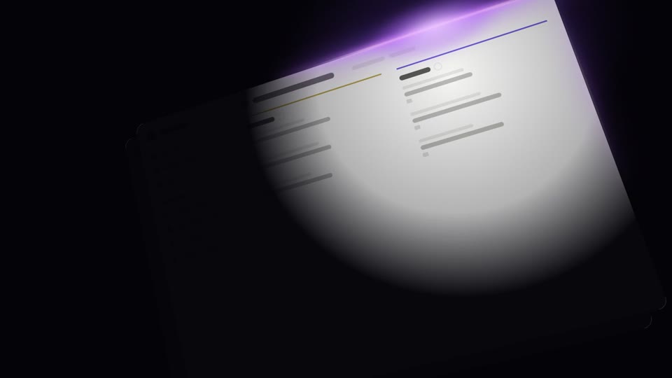
Dark-stage spotlight reveals
Three dark-stage spotlight reveals — A wake-sleep sweep (light in = bright, light out = dark), B edge-hugging glow pan (violet light seeps along UI edges + steady rightward sweep), C corner reveal (radial light expands steadily from a corner to light the whole screen); light itself narrates in the dark.
Slam entrance moves
Three high-energy slam entrances: a whip-in perspective stop, a heavy KPI drop, and a shockwave that hits neighboring cards.
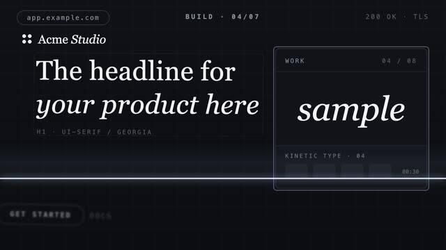
Scanline assemble fly-in
A scan line sweeps down an empty grid, flying each region's component in from off-screen — finishing as the scan ends.
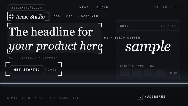
Scanline annotate focus
A bright scan line sweeps down the page, framing each element it passes and labeling it with monospace annotations.