Motion · UI entrance
Floating glossy label pills
Four wireframe panels each topped with a glossy pill label queue horizontally, swapping position in three beats while the centered panel enlarges and the sides shrink and blur, ending with a cursor sliding to rest.
Source: video-shotcraft (Vincent Wei) ↗ · Apache-2.0 · Remotion composition (React/TSX) — preview video, no in-browser player
When to use
For horizontal enumeration of multiple features (Feature A–D, one screen each); product-overview or feature-tour segments, also works as a looping hero background on a landing page.
Intention
Showing four features full-screen one by one takes four cuts, and the audience has to reorient each time. A corridor-style carousel has only one visual center: the centered panel is the lead, with a sliver of each neighbor visible on either side telling the audience "there's more, this is the same queue". The cursor at the end is deliberate: it hands the narrative back from "the system is auto-playing" to "a person is operating this", setting up the next beat's interaction shot.
Duration & energy
- Duration: About 4.0s (120f@30fps)
- Energy: Medium (the three-beat position swap forms the pulse, no explosive peak; the cursor is the closing hand-off of attention)
Shot recipe (original Chinese — timing, easing, parameter table, known pitfalls)
意图
四个功能挨个全屏展示会切四刀,观众每次都要重新定位。走廊式 carousel 只有一个视觉 中心:居中的那块是主角,左右各露一截邻居的边缘告诉观众"还有更多、这是同一条队列"。 末段的光标是刻意的:它把叙事从"系统在自动播放"交回"这是一个人在操作",为下一拍的 交互镜头做交接。
动效核心
- 这是手法模板:面板内容全是通用 wireframe 占位(顶栏 + 左侧导航 + 三栏卡片 /
折线图仪表盘 / 列表表格 / 表单开关列表四种页型),只用灰条与色块拼出,落地时整块 换成真实页面截图即可
- 轨道是逐帧实测拟合出来的三拍,写在
BEATS里:起点 0.200 / 0.483 / 0.688,行程
0.185 / 0.150 / 0.150。归一化进度对 inOutCubic 拟合极好(缓起→中段冲→缓收), 不是常见的"快进慢出"
- 首拍带长尾,用两条曲线加权混合:`0.85*seg(t, b, b+0.185, E.inOutCubic) +
0.15*seg(t, b, b+0.28, E.outCubic)`——主体在 0.185 内完成,剩 15% 拖到 0.48 才收住, 所以首拍读起来明显比后两拍软
- 开场有上一拍的收尾余量:
trackX = -11 * (1 - seg(t, 0, 0.19, E.outQuart)),t=0 时
轨道偏左 11px,在 0.19 内缓缓归位——一进画就"正在收尾"而非从静止启动
- 环形轨道:
wx = ((trackX - i*SP) % RING + RING*1.5) % RING - RING/2(SP=232,
RING=4*232),把每块折进 ±RING/2 的窗口里。任一拍都保证左右各有一个邻居贴在画面 边缘,走廊不断
- 一切属性由离心距离
d = min(1, |wx|/SP)驱动:scale = lerp(1-d, 0.62, 1)、
opacity = lerp(min(1, (1-d)*2.4), 0.78, 1)、blur = d*1.3px、 zIndex = (1-d) > 0.5 ? 2 : 1
- 面板与胶囊下沉曲线不同:面板
translateY(d*80),胶囊translateY(d*92)——
胶囊沉得更多,离心时会贴近面板顶边(实测中心 y 从 45 沉到 102)
- 胶囊的"高光"是三层叠出来的:180° 渐变(亮→主→深)+ 内阴影上白下暗
(inset 0 2px 3px rgba(255,255,255,.65) / inset 0 -4px 8px rgba(34,39,47,.5))+ 一枚 76% 宽的白色渐变 shine 覆在上 38%
- 光标:
seg(t, 0.717, 0.90, E.outQuart),opacity 在 0.717→0.725 内硬现(约 2f),
位置从 (403,36) 减速滑到 (281,56),之后到底几乎静止(每帧 <1px)
- 三块漂移雾块走不同周期的 sin/cos(
t*2π*0.5与t*2π*0.4),是唯一与轨道无关的
背景活性层
参数表
| 参数 | 典型值 | 调节手感 | |------|--------|----------| | 拍点 | 0.200 / 0.483 / 0.688,行程 0.185 / 0.150 / 0.150 | 首拍比后两拍慢 23%(含长尾更慢)——这个不均匀是实测来的手感,改成等长会读作机械播片 | | 首拍长尾 | 0.85×主曲线 + 0.15×outCubic(0.28) | 15% 的权重摊在 1.5 倍时长上;权重调到 0.3 以上尾巴会拖得能看出"还在动" | | 换位曲线 | E.inOutCubic | 缓起缓收是关键;换 outQuad(快进慢出)立刻读作被甩过去,走廊的从容感消失 | | 开场余量 | 左偏 11px,0.19 内 outQuart 归位 | 11px 是"上一拍刚结束"的暗示量;归零则开场是死的,>30px 会读作又一次换位 | | 中心距 | SP=232px(面板 W≈252) | SP < W 时邻居会压住居中面板边缘;SP 比 W 略小(232 vs 252)正是"露出一截"的来源 | | 邻位缩放 | lerp(close, 0.62, 1) | 0.62 是实测值;>0.75 时主次不分,<0.5 邻居小到读作缩略图而不是同类面板 | | 邻位下沉 | 面板 d*80px / 胶囊 d*92px | 两条曲线的差(12px)让胶囊离心时贴住面板顶边;改成同值会看到胶囊悬在面板上方 | | 邻位透明/模糊 | opacity 下限 0.78、blur d*1.3px | 邻位必须仍清楚可见——原片左右始终露着相邻面板边缘;opacity 压到 0.4 或 blur >3px 走廊就断了 | | 光标 | 0.717 硬现(2f),outQuart 滑到 0.90 后静止 | 硬现是"指针本来就在那";给它淡入会读作 UI 元素出现。outQuart 的强减速是鼠标的物理本能 | | 内容坐标系 | 内部 330×255,整体 scale(252/330) | 所有 wireframe 像素值写在 330×255 里,改面板尺寸只改 CS 一处 |
已知坑
- 整卡只有一个色相来源:
ACCENT及其ACCENT_LIGHT/ACCENT_DEEP三档,加上对应的
A_RGB / AL_RGB / AD_RGB 分量(渐变与阴影用)。换品牌色要改这 6 个变量,漏掉 RGB 分量会出现"胶囊换色了但雾霭还是旧色"
- 例外:表格行的状态色块(淡红/淡绿)与表单的开关(开=蓝
#2f7de1)是保留的功能色,
不跟 ACCENT 换肤——它们表达语义而非品牌
- 轨道拍点是从原片逐帧实测拟合的,不是设计出来的整数。别"顺手对齐"到 0.2/0.5/0.7,
首拍的长尾与后两拍的干脆是这个动效的辨识特征
- 三拍只走完 4 块中的 3 次换位(0→1→2→3),末位面板在 0.838 之后一直居中到底,约 0.16
(19f)的静置——这段静置是给光标滑到位用的,不是空白
phase: i*1.9在 groups 里计算了但没有被使用(轨道位置全由wx环形折算决定)。
移植时可以删掉,不要误以为它参与相位控制
- 面板 W/H、SP、PANEL_TOP、胶囊 top 与两条下沉斜率都是 480×270 裁切系下的实测常量。
改画布比例要整套重标,单独改一处会破坏"胶囊贴住面板顶边"的耦合
- 胶囊文案 Feature A–D 与 wireframe 内容都是占位。
rand(i)生成的骨架条宽度是确定性
伪随机(渲染可复现),移植时不要换成 Math.random
- 光标终点 (281,56) 是对着末位胶囊右端标的。换胶囊文案会改变胶囊宽度,光标就会停错
位置——文案变了必须重标光标终点
参考实现
demos/ui-entrance/floating-glossy-label-pills/ (FloatingGlossyLabelPills.tsx)
Reference implementation (Remotion)
- demos/ui-entrance/floating-glossy-label-pills/FloatingGlossyLabelPills.tsx — https://raw.githubusercontent.com/Vincentwei1021/video-shotcraft/main/demos/ui-entrance/floating-glossy-label-pills/FloatingGlossyLabelPills.tsx
The component imports shared fixtures from demos/_fixtures and helpers from assets/lib in the repo; SKILL.md there documents the render workflow.
Everything on this page is also machine-readable. Point your agent at the JSON, or add the gimgs MCP server and ask it to search motion templates.
- Fetch the JSON — it holds the shot recipe (timing, easing, parameter table, pitfalls) and the full TSX source.
- Clone the video-shotcraft repo; the component imports shared fixtures from demos/_fixtures and helpers from assets/lib.
- Register the component as a <Composition> in a Remotion project and render with `npx remotion render`, or re-implement the recipe in your own engine.
curl -s https://gimgs.net/motion/floating-glossy-label-pills.jsongit clone https://github.com/Vincentwei1021/video-shotcraft
# component: demos/ui-entrance/floating-glossy-label-pills/FloatingGlossyLabelPills.tsx
npx remotion render <CompositionId> out.mp4claude mcp add --transport http gimgs https://gimgs.net/mcp
# then: search_motion_templates / get_motion_template("floating-glossy-label-pills")Prompt
Use the video-shotcraft shot recipe "Floating glossy label pills" (Remotion composition, Apache-2.0) published on gimgs.net.
Recipe JSON (prompt = timing/easing/parameter table/pitfalls, files = TSX source): https://gimgs.net/motion/floating-glossy-label-pills.json
Raw TSX: https://gimgs.net/motion/floating-glossy-label-pills/template.html
Repository: https://github.com/Vincentwei1021/video-shotcraft  (component: demos/ui-entrance/floating-glossy-label-pills/FloatingGlossyLabelPills.tsx; imports demos/_fixtures and assets/lib)
Spec: 1920x1080, 30 fps, 4.5s

1. Read the JSON and follow its "prompt" section (when to use, intention, parameter table, known pitfalls).
2. Adapt it for: <describe what you want>.
3. Either clone the repo, register the component as a <Composition> in a Remotion project and run npx remotion render <CompositionId> out.mp4 — or re-implement the recipe in your own engine (HTML/WAAPI works: keep the same timing and easing).
// ===== demos/ui-entrance/floating-glossy-label-pills/FloatingGlossyLabelPills.tsx =====
// floating-glossy-label-pills — Glossy Pills Carousel 高光胶囊横滑走廊(motion-lab 定稿转原生 Remotion)
// 白底四角强调色雾霭,四块浅灰 dashboard 占位 mockup(三栏卡片 / 折线图仪表盘 /
// 列表表格 / 表单+开关列表)横向排队,各顶一枚高光强调色胶囊标签(Feature A–D);
// 轨道环形循环,任一拍居中面板左右都露出相邻面板边缘。开场有上一拍收尾余量
// (偏左 11px 缓归位),随后轨道三拍向右换位(t≈0.20/0.483/0.688,inOutCubic,
// 第一拍带长尾)——居中者放大清晰,两侧缩至 0.62、下沉变淡微模糊;t≈0.717 黑色
// 描白边光标右上硬现,减速斜滑向左下,t≈0.90 停在末位胶囊右端。
// 整卡唯一色相来源是 ACCENT 及其深浅档,按项目品牌色替换即换肤。
// 设计坐标 480×270(DesignStage 等比放大),参数表数值以此坐标系标定。
import React from 'react';
import { DesignStage, E, lerp, rand, seg, useT } from '../../_fixtures/Motion';

export const FLOATING_GLOSSY_LABEL_PILLS_DURATION = 120; // 4000ms @30fps

// ── 模板强调色:实际使用时按项目品牌色替换这一组变量 ──
const ACCENT = '#7a8699'; // 中性蓝灰做默认演示色
const ACCENT_LIGHT = '#a8b2c0', ACCENT_DEEP = '#4c5666';
const A_RGB = '122,134,153', AL_RGB = '168,178,192', AD_RGB = '76,86,102';
const F = '-apple-system,BlinkMacSystemFont,sans-serif';

// 逐帧实测(480×270 裁切系):
//   居中面板 x 105-357(W≈252)、top=75,下缘正好压住画面底 → 真高 H≈195
//   邻位(静止)面板 x -70..86(缩到 0.62)、top=126 → 缩放 + 下沉 51px
//   相邻两块中心距 SP≈232
// 内部 UI 按 330×255 的内容坐标书写,再整体等比 scale 到 252×195
const CW = 330, CH = 255, CS = 252 / CW;
const W = Math.round(CW * CS), H = Math.round(CH * CS), SP = 232;
const PANEL_TOP = 75;

// ── 通用占位(wireframe / skeleton)零件:全部只用灰条 + 色块,不写具体文案 ──
const TITLE = '#a8adb5', TEXT = '#d4d7dd', FAINT = '#e3e5ea', LINE = '#eceef1';

// 骨架条:默认圆角 min(h/2, 3)
const Skel: React.FC<{ x: number; y: number; w: number; h: number; col: string; r?: number }> = ({ x, y, w, h, col, r }) => (
  <div
    style={{
      position: 'absolute',
      left: x,
      top: y,
      width: w,
      height: h,
      borderRadius: r === undefined ? Math.min(h / 2, 3) : r,
      background: col,
    }}
  />
);

// 窗口顶栏:强调色方块 + 字标灰条 + 右侧两枚圆点(各页面通用 chrome)
const Topbar: React.FC = () => (
  <div style={{ position: 'absolute', left: 0, top: 0, width: '100%', height: 16, background: '#fff', borderBottom: '1px solid #eceef1', zIndex: 1 }}>
    <Skel x={8} y={4} w={8} h={8} col={ACCENT} r={2} />
    <Skel x={20} y={6} w={28} h={5} col="#b9bec6" />
    <div style={{ position: 'absolute', right: 8, top: 5.5, width: 5, height: 5, borderRadius: '50%', background: '#d8dbe0' }} />
    <div style={{ position: 'absolute', right: 18, top: 5.5, width: 5, height: 5, borderRadius: '50%', background: '#d8dbe0' }} />
  </div>
);

// 左侧导航:一条高亮项 + 若干灰条
const Sidebar: React.FC = () => (
  <div style={{ position: 'absolute', left: 0, top: 16, width: 70, height: 'calc(100% - 16px)', background: '#f7f8f9', borderRight: '1px solid #eceef1' }}>
    <Skel x={8} y={8} w={36} h={8} col={ACCENT} />
    {Array.from({ length: 8 }, (_, i) => (
      <Skel key={i} x={8} y={26 + i * 11} w={30 + rand(i + 9) * 22} h={4} col={i === 1 ? ACCENT_LIGHT : '#d8dbe0'} />
    ))}
  </div>
);

// 1) 三栏卡片占位(居中标题 + 三张卡:标题条/大字块/文本骨架/按钮块)
const BCards: React.FC = () => (
  <>
    <Topbar />
    <Skel x={CW / 2 - 46} y={30} w={92} h={9} col={TITLE} />
    <Skel x={CW / 2 - 70} y={46} w={140} h={5} col={FAINT} />
    {Array.from({ length: 3 }, (_, i) => (
      <div key={i} style={{ position: 'absolute', left: 16 + i * 104, top: 64, width: 92, height: 170, border: `1px solid ${LINE}`, borderRadius: 6, background: '#fff' }}>
        <Skel x={10} y={12} w={38} h={6} col="#b9bec6" />
        <Skel x={10} y={26} w={52} h={14} col={TITLE} r={4} />
        {Array.from({ length: 5 }, (_, k) => (
          <Skel key={k} x={10} y={52 + k * 13} w={44 + rand(i * 7 + k) * 26} h={4} col={FAINT} />
        ))}
        <Skel x={10} y={142} w={72} h={16} col={ACCENT} r={4} />
      </div>
    ))}
  </>
);

// 2) 仪表盘占位(四枚数值卡 + 折线图占位)
const BDash: React.FC = () => (
  <>
    <Topbar />
    <Sidebar />
    <Skel x={84} y={26} w={64} h={9} col={TITLE} />
    {Array.from({ length: 4 }, (_, i) => (
      <div key={i} style={{ position: 'absolute', left: 84 + i * 60, top: 44, width: 54, height: 32, border: `1px solid ${LINE}`, borderRadius: 6, background: '#fff' }}>
        <Skel x={7} y={7} w={34} h={8} col={TITLE} />
        <Skel x={7} y={20} w={22} h={3} col={FAINT} />
      </div>
    ))}
    <div style={{ position: 'absolute', left: 84, top: 86, width: 232, height: 146, border: `1px solid ${LINE}`, borderRadius: 6, background: '#fff' }}>
      <Skel x={8} y={8} w={56} h={5} col={TEXT} />
      <svg viewBox="0 0 232 146" style={{ position: 'absolute', inset: 0, width: '100%', height: '100%' }}>
        <path d="M8 116 C 40 112, 56 62, 84 64 S 128 120, 152 116 S 196 50, 224 56 L224 134 L8 134 Z" fill={`rgba(${A_RGB},.18)`} />
        <path d="M8 116 C 40 112, 56 62, 84 64 S 128 120, 152 116 S 196 50, 224 56" fill="none" stroke={ACCENT} strokeWidth={2} />
      </svg>
      {Array.from({ length: 5 }, (_, i) => (
        <Skel key={i} x={12 + i * 44} y={138} w={22} h={3} col={FAINT} />
      ))}
    </div>
  </>
);

// 3) 列表 / 表格占位(小统计条 + 多行骨架 + 状态色块)
const BTable: React.FC = () => (
  <>
    <Topbar />
    <Sidebar />
    <Skel x={84} y={26} w={76} h={9} col={TITLE} />
    {Array.from({ length: 4 }, (_, i) => (
      <div key={i} style={{ position: 'absolute', left: 84 + i * 60, top: 44, width: 54, height: 22, border: `1px solid ${LINE}`, borderRadius: 6, background: '#fff' }}>
        <Skel x={7} y={7} w={26 + rand(i + 3) * 14} h={8} col={TITLE} />
      </div>
    ))}
    {Array.from({ length: 7 }, (_, i) => (
      <div key={i} style={{ position: 'absolute', left: 84, top: 78 + i * 22, width: 232, height: 18, borderBottom: '1px solid #f0f1f4' }}>
        <Skel x={0} y={6} w={70 + rand(i + 21) * 60} h={5} col={TEXT} />
        {/* 状态色块保留功能色(异常淡红 / 正常淡绿) */}
        <Skel x={172} y={4} w={26} h={9} col={i % 2 ? '#f2d6d6' : '#cdeccf'} r={4} />
        <div style={{ position: 'absolute', left: 226, top: 6, width: 6, height: 6, borderRadius: '50%', background: '#28c06a' }} />
      </div>
    ))}
  </>
);

// 4) 表单 + 开关列表占位(左侧字段框,右侧头像色块行 + 开关)
const BForm: React.FC = () => (
  <>
    <Topbar />
    <Sidebar />
    <Skel x={84} y={26} w={96} h={9} col={TITLE} />
    <Skel x={84} y={44} w={44} h={5} col="#b9bec6" />
    {Array.from({ length: 3 }, (_, i) => (
      <React.Fragment key={i}>
        <Skel x={84} y={56 + i * 26} w={34 + rand(i + 51) * 30} h={4} col={TEXT} />
        <div style={{ position: 'absolute', left: 84, top: 64 + i * 26, width: 120, height: 13, border: '1px solid #dcdfe4', borderRadius: 4, background: '#fff' }} />
      </React.Fragment>
    ))}
    <Skel x={84} y={140} w={120} h={15} col="#26282d" r={8} />
    <Skel x={84} y={168} w={60} h={5} col="#b9bec6" />
    {Array.from({ length: 3 }, (_, i) => (
      <Skel key={i} x={84} y={180 + i * 9} w={110 + rand(i + 71) * 60} h={3} col={FAINT} />
    ))}
    <Skel x={218} y={44} w={40} h={5} col="#b9bec6" />
    <Skel x={218} y={122} w={52} h={5} col="#b9bec6" />
    {Array.from({ length: 4 }, (_, i) => (
      <div key={i} style={{ position: 'absolute', left: 218, top: 56 + i * 30 + (i > 1 ? 22 : 0), width: 100, height: 22 }}>
        <div style={{ position: 'absolute', left: 0, top: 3, width: 13, height: 13, borderRadius: '50%', background: `hsl(${212 + i * 4},14%,${56 + i * 5}%)` }} />
        <Skel x={19} y={3} w={48} h={4} col="#c2c6cc" />
        <Skel x={19} y={11} w={32} h={4} col={FAINT} />
        {/* 开关保留功能色(开=蓝 / 关=灰) */}
        <div style={{ position: 'absolute', right: 0, top: 4, width: 18, height: 10, borderRadius: 6, background: i % 2 ? '#d6d9de' : '#2f7de1' }}>
          <div style={{ position: 'absolute', top: 1.5, ...(i % 2 ? { left: 1.5 } : { right: 1.5 }), width: 7, height: 7, borderRadius: '50%', background: '#fff' }} />
        </div>
      </div>
    ))}
  </>
);

// 四组:胶囊 + 占位 mockup 横向排队(i 越大越靠左,滑入中央越晚),轨道循环
const GROUPS: { txt: string; Body: React.FC }[] = [
  { txt: 'Feature A', Body: BCards },
  { txt: 'Feature B', Body: BDash },
  { txt: 'Feature C', Body: BTable },
  { txt: 'Feature D', Body: BForm },
];

// 雾块静态参数(位置 / 颜色)
const FOGS = [
  { left: '68%', top: '8%', rgb: AD_RGB },
  { left: '4%', top: '60%', rgb: A_RGB },
  { left: '40%', top: '82%', rgb: AL_RGB },
];

// 轨道三拍:起点 t≈0.20 / 0.483 / 0.688,inOutCubic 缓起→中段冲→缓收;
// 第一拍明显更慢且带长尾(到 t≈0.48 才完全收住),后两拍干脆些。
const BEATS = [
  { b: 0.200, d: 0.185, tail: 0.28 }, // 第 1 位 → 第 2 位
  { b: 0.483, d: 0.150, tail: 0 },    // 第 2 位 → 第 3 位
  { b: 0.688, d: 0.150, tail: 0 },    // 第 3 位 → 第 4 位
];

export const FloatingGlossyLabelPills: React.FC = () => {
  const t = useT();
  // 开场有上一拍的收尾余量:t=0 时轨道偏左 11px,t≈0.19 归位
  let trackX = -11 * (1 - seg(t, 0, 0.19, E.outQuart));
  for (const B of BEATS) {
    const p = B.tail
      ? 0.85 * seg(t, B.b, B.b + B.d, E.inOutCubic) + 0.15 * seg(t, B.b, B.b + B.tail, E.outCubic)
      : seg(t, B.b, B.b + B.d, E.inOutCubic);
    trackX += p * SP;
  }
  const N = GROUPS.length, RING = N * SP;
  // 光标:t≈0.717 于右上(x≈403,y≈36)一帧硬现,减速斜滑向左下,
  // t≈0.90 抵达末位胶囊右端附近(x≈281,y≈56)后几乎静止
  const cp = seg(t, 0.717, 0.90, E.outQuart);
  return (
    <DesignStage bg="#fbfbfc">
      <div
        style={{
          position: 'absolute',
          inset: 0,
          overflow: 'hidden',
          background: `radial-gradient(55% 75% at 106% 42%, rgba(${A_RGB},.55), transparent 70%),
      radial-gradient(42% 50% at -6% 88%, rgba(${AD_RGB},.42), transparent 70%),
      radial-gradient(48% 40% at 12% -10%, rgba(${AL_RGB},.5), transparent 70%),
      #fbfbfc`,
        }}
      >
        {/* 漂移雾块 */}
        {FOGS.map(({ left, top, rgb }, i) => (
          <div
            key={i}
            style={{
              position: 'absolute',
              left,
              top,
              width: 240,
              height: 160,
              borderRadius: '50%',
              filter: 'blur(50px)',
              background: `rgba(${rgb},.14)`,
              transform: `translate(${Math.sin(t * Math.PI * 2 * 0.5 + i * 2.1) * 18}px,${Math.cos(t * Math.PI * 2 * 0.4 + i) * 12}px)`,
            }}
          />
        ))}

        {GROUPS.map(({ txt, Body }, i) => {
          // 环形轨道:面板绕 4 位循环,保证任一拍都有左右邻居各露一截在画面边缘
          let wx = trackX - i * SP;
          wx = ((wx % RING) + RING * 1.5) % RING - RING / 2;
          const d = Math.min(1, Math.abs(wx) / SP); // 0=正居中,1=已到邻位
          const close = 1 - d;
          const sc = lerp(close, 0.62, 1);          // 邻位实测缩到 0.62
          return (
            <div
              key={i}
              style={{
                position: 'absolute',
                left: '50%',
                top: 0,
                width: W,
                height: 270,
                marginLeft: -W / 2,
                transform: `translateX(${wx}px)`,
                // 邻位(d=1)必须仍清楚可见 —— 原片左右两侧始终露出相邻面板边缘
                opacity: lerp(Math.min(1, close * 2.4), 0.78, 1),
                filter: `blur(${d * 1.3}px)`,
                zIndex: close > 0.5 ? 2 : 1,
              }}
            >
              {/* 面板:等比缩小 + 顶边随 d 线性下沉(斜率 ≈80px) */}
              <div
                style={{
                  position: 'absolute',
                  left: 0,
                  top: PANEL_TOP,
                  width: W,
                  height: H,
                  borderRadius: 8,
                  transformOrigin: '50% 0',
                  boxShadow: `0 0 0 1.5px rgba(${A_RGB},.6), 0 14px 34px rgba(${AD_RGB},.22)`,
                  transform: `translateY(${d * 80}px) scale(${sc})`,
                }}
              >
                <div
                  style={{
                    position: 'absolute',
                    left: 0,
                    top: 0,
                    width: CW,
                    height: CH,
                    borderRadius: 10,
                    background: '#fff',
                    overflow: 'hidden',
                    transform: `scale(${CS})`,
                    transformOrigin: '0 0',
                    fontFamily: F,
                  }}
                >
                  <Body />
                </div>
              </div>
              {/* 胶囊:实测中心 y 从 45(居中)沉到 102(邻位),比面板沉得更多,
                  离心时贴近面板顶边 —— 单独一条更陡的下沉曲线 */}
              <div
                style={{
                  position: 'absolute',
                  left: '50%',
                  top: 28,
                  transformOrigin: '50% 50%',
                  padding: '4px 13px',
                  borderRadius: 999,
                  whiteSpace: 'nowrap',
                  // 原 cssText 中 font 简写在 line-height:1 之后,实际生效行高为 normal
                  font: `700 14px ${F}`,
                  color: '#fff',
                  background: `linear-gradient(180deg,${ACCENT_LIGHT} 0%,${ACCENT} 45%,${ACCENT_DEEP} 100%)`,
                  boxShadow: `inset 0 2px 3px rgba(255,255,255,.65), inset 0 -4px 8px rgba(34,39,47,.5),
          0 12px 28px rgba(${AD_RGB},.35)`,
                  transform: `translateX(-50%) translateY(${d * 92}px) scale(${sc})`,
                }}
              >
                {txt}
                <div
                  style={{
                    position: 'absolute',
                    left: '12%',
                    top: 3,
                    width: '76%',
                    height: '38%',
                    borderRadius: 999,
                    background: 'linear-gradient(180deg,rgba(255,255,255,.75),rgba(255,255,255,0))',
                    pointerEvents: 'none',
                  }}
                />
              </div>
            </div>
          );
        })}

        {/* 黑色描白边光标(结尾划向末位胶囊,macOS 指针样式) */}
        <div
          style={{
            position: 'absolute',
            width: 0,
            height: 0,
            borderLeft: '8px solid #0d0d11',
            borderRight: '4px solid transparent',
            borderBottom: '14px solid transparent',
            filter: 'drop-shadow(0 0 1px #fff) drop-shadow(0 0 1px #fff) drop-shadow(0 2px 3px rgba(0,0,0,.3))',
            transform: 'rotate(-16deg)',
            opacity: seg(t, 0.717, 0.725),
            zIndex: 5,
            left: `${(lerp(cp, 403, 281) / 480) * 100}%`,
            top: `${(lerp(cp, 36, 56) / 270) * 100}%`,
          }}
        />
      </div>
    </DesignStage>
  );
};
- Read the recipePrompt = when to use, intention, parameter table with typical values and how each one feels, known pitfalls. Treat values as calibrated starting points.
- Get the codetool: git
git clone https://github.com/Vincentwei1021/video-shotcraft && cd video-shotcraft && npm install - Register + rendertool: remotion
npx remotion render <CompositionId> out.mp4 # component: demos/ui-entrance/floating-glossy-label-pills/FloatingGlossyLabelPills.tsx - Or re-implementPort the timing/easing from the recipe to HTML + WAAPI (gimgs motion contract) or any engine; keep the same segment windows and easing.
| param | type | default | description |
|---|---|---|---|
| — | |||
More in this category
Wall reveal: three moves
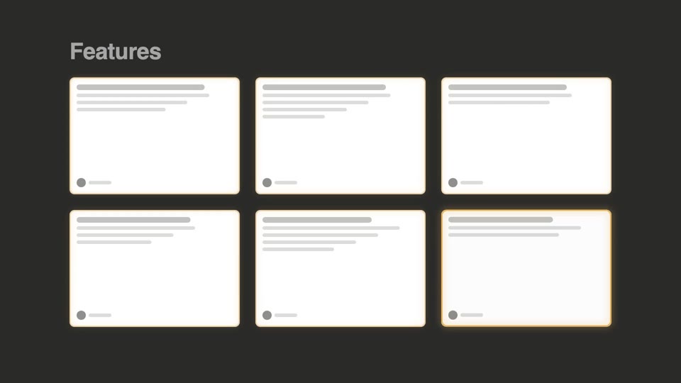
Three whole-wall batch entrances — bento cell-by-cell light-up, grid wave flip, and blueprint draw-on; all reveal in place with no displacement, complementing the fly-in, displacement-type deck-deal-flyin.
Value-stagger gradient bars
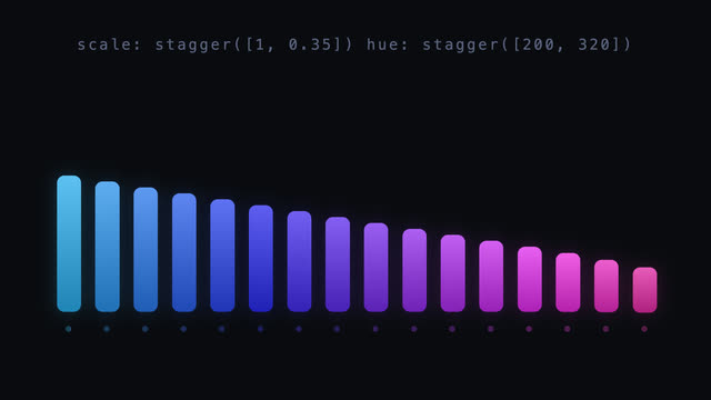
16 bars enter with delay as a time stagger, while height/hue/offset/blur each lay out as a value gradient from first to last; the second beat moves the stagger origin to center and re-lays the pulse peaking there.
SVG shape morph loop
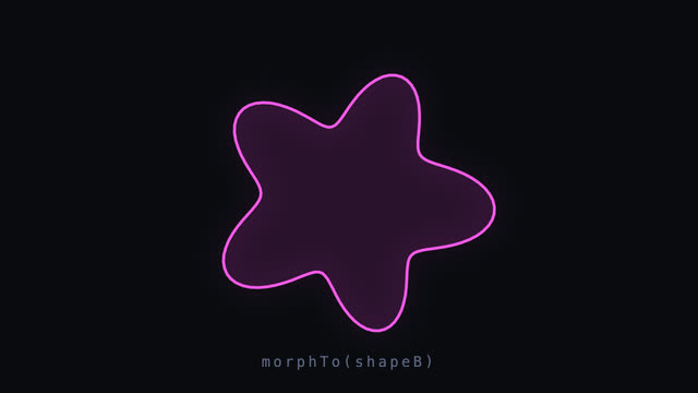
A 140-point closed outline morphs smoothly into another and back; both shapes are resampled to equal point counts in polar coordinates with per-point radius interpolation and inOutCubic, plus a light scale breathing, slow rotation, and hue drifting 185°→305° mid-morph.
Skeleton reveal
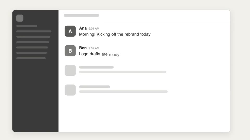
Three-tier reveal from sketch to structure to content — hand-drawn doodles get swapped for skeleton bars, which resolve into real UI.