Motion · Interaction
Input trigger moves
Two input-trigger styles: cursor-performance, a cursor performance push-in click, and keycap-smash-cut, a keycap-fuse detonation hard cut.
Source: video-shotcraft (Vincent Wei) ↗ · Apache-2.0 · Remotion composition (React/TSX) — preview video, no in-browser player
Variants
The cursor slides in along three bezier arcs with a wrist-flick overshoot at the end, brightening on hover; on the click frame the button depresses plus a ripple, the camera pushes in 1.4x, holds two beats, then eases back out.
A demo close-up of a core button/interaction
Keycap hovers breathing → 3f squash with a bright ring as the fuse → 30f of cards rushing at the camera from all sides, accelerating with a roar → the most violent-motion frame hard-cuts to a still full view, the keycap embedded in the top bar.
The film's opening verdict; the highest energy
When to use
First-person segments of a launch film: demoing the core interaction, the opening as the climax; the audience is "using" the product, not "watching" it.
Intention
The first-person grammar of a launch film — the audience isn't "watching" the product, they're "using" it: the cursor is the hand, the keycap is the fingertip, the trigger itself is the narrative. Both styles share one thing: the interaction is the trigger, the product visuals are the gunshot. A is a slow trigger — a cursor with visible personality glides in and clicks, the camera pushes in toward the click point then eases back out, a round trip (unlike crash-zoom: this is slow, anchored to the cursor, and comes back); C is the fuse — a fake-3D keycap hovers breathing, squashes with a bright rim overflow as the fuse, and pressing it detonates a full-screen roar, the most climactic frame hard-cutting into a perfectly still full view — press → burst → verdict. Pick A to demo an interaction, C for an opening that's already the climax.
Duration & energy
- Duration: A: ~5s / C: ~5s
- Energy: A: Medium / C: High
Shot recipe (original Chinese — timing, easing, parameter table, known pitfalls)
意图
发布片的第一人称语法——观众不是在"看"产品,是在"用"产品:光标 是手、键帽是指尖、触发即叙事。两式共同点:交互动作当扳机,产品 画面当枪响。A 是慢扳机——放大光标带性格地滑入点击,镜头以点击点 推近再缓退,有去有回(区别 crash-zoom:慢速、锚定光标、会回来); C 是引信——假 3D 键帽(⌘K)呼吸悬浮,3f 压扁+底部亮环溢出当引信, 按下引爆 30f 满屏轰鸣,最高潮一帧猛切成整齐静止全景, 按下→爆发→定论。选型:演示交互用 A,开场即高潮用 C。
两式选型
| 式 | 做法 | 适用 | |----|------|------| | A cursor-performance | 光标三次贝塞尔弧线滑入+末端甩腕过冲,悬停提亮,点击帧按钮下陷+涟漪+推近 1.4x 停两拍缓退 | 核心按钮/交互的演示特写 | | C keycap-smash-cut | 键帽呼吸悬浮→3f 压扁+亮环引信 + 30f 卡片四面冲镜持续加速轰鸣 + 动势最猛一帧硬切静止全景、键帽嵌顶栏 | 全片开场定论;能量最高 |
参数表
| 参数 | 典型值 | 调节手感 | |------|--------|----------| | A 甩腕 | 贝塞尔 t 到 f24 过冲 1.05 再 6f 拐回 | 无过冲的直线滑入没有"性格" | | A 悬停提亮 | 深底 #2f2f2f→#555553(4f)+ scale 1.05 | 白底提亮不可见(提亮判例),深色底才成立 | | A 涟漪 | 直径 60→380 out-cubic 22f 扩散 / opacity 0.9→0 线性 26f 消散,解耦;f66 条件卸载 | 扩散消散同曲线读作一坨淡出 | | A 推近 | f40–52 scale 1→1.4(与点击同帧起跳)→停 20f→18f inOut 退回;origin 钉点击点 | 光标与按钮必须同缩放层,否则推近漂移 | | C 引信压扁 | box-shadow 厚度 12→3px、3f 完成 + 下沉 14px + 键面变暗;亮环 out-cubic 90→560px 扩散、线性消散解耦 | 厚度被压扁的 3f 是灵魂——命门;无厚度差只是变色 | | C 轰鸣 | 28–58f 六物两轮 pass(第二轮更短)Easing.in(quad) 加速 + scale 1.5→3 + blur 1→5px 速度门控 | 全程必须一直在加速,匀速轰鸣泄劲 | | C 猛切 | f58 一帧 return 静止 JSX,键帽 44px 嵌顶栏,死寂 ≥82f | 切后画面不能有任何随帧属性 |
已知坑
- demo 在灰阶/占位素材上调校通过——参数是调校起点非实战定稿,
首次实战须以真实素材回验
- 全片输入触发 ≤2 次——每次都该是段落级开关;连按三次键帽
观众就知道这只是转场花活,扳机失效
- A/C 声音强依赖:click 采样/键击采样与触发帧同帧
(sound-design §4.5);无声的按下读作画面自己动了
- C 的猛切后键帽必须在新场景里回收(嵌顶栏呼应引信)——否则
只是两个手法排队,不是组合——组合命门
- C 的轰鸣段与 smash-cut 卡(trailer-grammar-moves C 式)同源,
同片二选一
参考实现
demos/interaction/input-trigger-moves/ (CursorPerformancePunchIn.tsx / KeycapSmashCut.tsx)
Reference implementation (Remotion)
- demos/interaction/input-trigger-moves/CursorPerformancePunchIn.tsx — https://raw.githubusercontent.com/Vincentwei1021/video-shotcraft/main/demos/interaction/input-trigger-moves/CursorPerformancePunchIn.tsx
- demos/interaction/input-trigger-moves/KeycapSmashCut.tsx — https://raw.githubusercontent.com/Vincentwei1021/video-shotcraft/main/demos/interaction/input-trigger-moves/KeycapSmashCut.tsx
The component imports shared fixtures from demos/_fixtures and helpers from assets/lib in the repo; SKILL.md there documents the render workflow.
Everything on this page is also machine-readable. Point your agent at the JSON, or add the gimgs MCP server and ask it to search motion templates.
- Fetch the JSON — it holds the shot recipe (timing, easing, parameter table, pitfalls) and the full TSX source.
- Clone the video-shotcraft repo; the component imports shared fixtures from demos/_fixtures and helpers from assets/lib.
- Register the component as a <Composition> in a Remotion project and render with `npx remotion render`, or re-implement the recipe in your own engine.
curl -s https://gimgs.net/motion/input-trigger-moves.jsongit clone https://github.com/Vincentwei1021/video-shotcraft
# component: demos/interaction/input-trigger-moves/CursorPerformancePunchIn.tsx, demos/interaction/input-trigger-moves/KeycapSmashCut.tsx
npx remotion render <CompositionId> out.mp4claude mcp add --transport http gimgs https://gimgs.net/mcp
# then: search_motion_templates / get_motion_template("input-trigger-moves")Prompt
Use the video-shotcraft shot recipe "Input trigger moves" (Remotion composition, Apache-2.0) published on gimgs.net.
Recipe JSON (prompt = timing/easing/parameter table/pitfalls, files = TSX source): https://gimgs.net/motion/input-trigger-moves.json
Raw TSX: https://gimgs.net/motion/input-trigger-moves/template.html
Repository: https://github.com/Vincentwei1021/video-shotcraft  (component: demos/interaction/input-trigger-moves/CursorPerformancePunchIn.tsx, demos/interaction/input-trigger-moves/KeycapSmashCut.tsx; imports demos/_fixtures and assets/lib)
Spec: 1920x1080, 30 fps, 5.06s

1. Read the JSON and follow its "prompt" section (when to use, intention, parameter table, known pitfalls).
2. Adapt it for: <describe what you want>.
3. Either clone the repo, register the component as a <Composition> in a Remotion project and run npx remotion render <CompositionId> out.mp4 — or re-implement the recipe in your own engine (HTML/WAAPI works: keep the same timing and easing).
// ===== demos/interaction/input-trigger-moves/CursorPerformancePunchIn.tsx =====
// cursor-performance-punch-in —— 光标拟人表演 + 点击跟随推近
// 放大光标沿贝塞尔曲线从左下滑入(末端甩腕过冲)→ 悬停按钮微亮响应 →
// 点击:按钮下陷 + 涟漪扩散 + 整画布以点击点为原点推近 1→1.4 → 停 → 缓退回。
// 推近"有去有回"区别 crash-zoom。收尾真静止 ≥35f。全灰阶。
import React from 'react';
import { useCurrentFrame, interpolate, Easing } from 'remotion';
import { FakeDashboard, G } from '../../_fixtures/Fixtures';

// 时间轴(30fps,共 150f)
const T = {
  cursorInEnd: 30, // 0–30f 光标贝塞尔滑入(f24 过冲峰值,f24–30 拐回落定)
  click: 40,       // 30–40f 悬停响应 10f;f40 点击
  punchEnd: 52,    // 40–52f 推近 1→1.4(out-cubic)
  holdEnd: 72,     // 52–72f 停 20f
  backEnd: 90,     // 72–90f 缓退回 1.0(inOut-cubic)
  total: 150,      // 90–150f 真静止 60f
};

// 按钮与点击点(画布坐标)
const BTN = { x: 1560, y: 130, w: 200, h: 64 };
const CLICK = { x: 1665, y: 168 };

// 光标贝塞尔路径:左下滑入,先沉后扬,曲线有性格
const P0 = { x: 180, y: 1000 };
const P1 = { x: 820, y: 1075 };
const P2 = { x: 1795, y: 560 };
const P3 = { x: CLICK.x, y: CLICK.y };
const bez = (t: number) => {
  const u = 1 - t;
  return {
    x: u * u * u * P0.x + 3 * u * u * t * P1.x + 3 * u * t * t * P2.x + t * t * t * P3.x,
    y: u * u * u * P0.y + 3 * u * u * t * P1.y + 3 * u * t * t * P2.y + t * t * t * P3.y,
  };
};

const Cursor: React.FC<{ x: number; y: number }> = ({ x, y }) => (
  <svg
    width={48}
    height={48}
    viewBox="0 0 28 28"
    style={{
      position: 'absolute',
      left: x - 3.4,
      top: y - 1.7,
      filter: 'drop-shadow(0 4px 7px rgba(0,0,0,0.4))',
    }}
  >
    <path
      d="M2 1 L2 23 L8 17.5 L11.5 25 L15.5 23.2 L12 15.8 L20 15 Z"
      fill="#ffffff"
      stroke="#2f2f2f"
      strokeWidth={1.6}
      strokeLinejoin="round"
    />
  </svg>
);

export const CursorPerformancePunchIn: React.FC = () => {
  const frame = useCurrentFrame();

  // —— 光标:路径参数 t,f24 过冲到 1.05(沿切线甩过按钮),f24–30 拐回 1.0 ——
  const t =
    frame < 24
      ? interpolate(frame, [0, 24], [0, 1.05], {
          extrapolateLeft: 'clamp', extrapolateRight: 'clamp',
          easing: Easing.out(Easing.cubic),
        })
      : interpolate(frame, [24, T.cursorInEnd], [1.05, 1], {
          extrapolateLeft: 'clamp', extrapolateRight: 'clamp',
          easing: Easing.inOut(Easing.quad),
        });
  const cur = bez(t);
  // 点击帧光标随按钮微沉 3px(f40–42 下,f42–46 回)
  const dip = interpolate(frame, [T.click, T.click + 2, T.click + 6], [0, 3, 0], {
    extrapolateLeft: 'clamp', extrapolateRight: 'clamp',
  });

  // —— 悬停响应:f30–34 按钮提亮(深底提亮可见)+ 微放大 ——
  const lift = interpolate(frame, [T.cursorInEnd, T.cursorInEnd + 4], [0, 1], {
    extrapolateLeft: 'clamp', extrapolateRight: 'clamp',
  });
  const c = Math.round(47 + 38 * lift); // #2f2f2f → #555553 近似
  const hoverScale = 1 + 0.05 * lift;

  // —— 点击下陷:f40–42 scale→0.94,f42–46 弹回 ——
  const press = interpolate(frame, [T.click, T.click + 2, T.click + 6], [1, 0.94, 1], {
    extrapolateLeft: 'clamp', extrapolateRight: 'clamp',
  });

  // —— 推近有去有回:40–52f 1→1.4(out-cubic);72–90f 1.4→1(inOut)——
  const zoom =
    frame < T.holdEnd
      ? interpolate(frame, [T.click, T.punchEnd], [1, 1.4], {
          extrapolateLeft: 'clamp', extrapolateRight: 'clamp',
          easing: Easing.out(Easing.cubic),
        })
      : interpolate(frame, [T.holdEnd, T.backEnd], [1.4, 1], {
          extrapolateLeft: 'clamp', extrapolateRight: 'clamp',
          easing: Easing.inOut(Easing.cubic),
        });

  // —— 涟漪:扩散 out-cubic(40–62f,直径 60→380),消散线性(40–66f)帧时间解耦 ——
  const rippleAlive = frame >= T.click && frame < T.click + 26;
  const rippleD = interpolate(frame, [T.click, T.click + 22], [60, 380], {
    extrapolateLeft: 'clamp', extrapolateRight: 'clamp',
    easing: Easing.out(Easing.cubic),
  });
  const rippleOp = interpolate(frame, [T.click, T.click + 26], [0.9, 0], {
    extrapolateLeft: 'clamp', extrapolateRight: 'clamp',
  });
  const rippleBw = interpolate(frame, [T.click, T.click + 22], [9, 3], {
    extrapolateLeft: 'clamp', extrapolateRight: 'clamp',
  });

  return (
    <div style={{ width: 1920, height: 1080, background: G.bg, overflow: 'hidden', position: 'relative' }}>
      {/* 整画布以点击点为原点推近 */}
      <div style={{
        position: 'absolute', inset: 0,
        transform: `scale(${zoom})`,
        transformOrigin: `${CLICK.x}px ${CLICK.y}px`,
      }}>
        <FakeDashboard variant="A" />

        {/* 右上自绘 Deploy 按钮(叠在页面上) */}
        <div style={{
          position: 'absolute', left: BTN.x, top: BTN.y, width: BTN.w, height: BTN.h,
          borderRadius: 14, background: `rgb(${c},${c},${c - 2})`,
          boxShadow: '0 6px 18px rgba(0,0,0,0.28)',
          display: 'flex', alignItems: 'center', justifyContent: 'center',
          transform: `scale(${hoverScale * press})`,
          fontFamily: 'Helvetica, Arial, sans-serif', fontWeight: 700,
          fontSize: 27, color: '#ffffff', letterSpacing: 0.5,
        }}>
          Deploy
        </div>

        {/* 涟漪圆环:条件挂载,f66 后摘除 */}
        {rippleAlive && (
          <div style={{
            position: 'absolute',
            left: CLICK.x - rippleD / 2, top: CLICK.y - rippleD / 2,
            width: rippleD, height: rippleD, borderRadius: '50%',
            border: `${rippleBw}px solid ${G.ink}`,
            opacity: rippleOp,
          }} />
        )}

        {/* 放大光标(随画布一起被推近,钉在按钮上) */}
        <Cursor x={cur.x} y={cur.y + dip} />
      </div>
    </div>
  );
};


// ===== demos/interaction/input-trigger-moves/KeycapSmashCut.tsx =====
// keycap-smash-cut|键帽引信+猛切句号(keycap-press-trigger × smash-cut)
// 0–25f 浅底中央 3D 键帽(⌘⏎)悬浮呼吸 → 25–28f 砰按下(3f 下沉 14px +
// 底座 12→3px 压扁 + 键面变暗)+ 底部亮环(扩散 out-cubic / 消散线性解耦)
// → 按下即引爆轰鸣段 28–58f:5 张卡 + 1 面板从四面八方高速飞入冲镜
// (ease-in 全程加速 + scale 1.5→3 冲脸 + 速度门控 blur),背景整体
// ease-in 推近 1→1.3 + 滚动 1.5°——切点前一刻动势最猛 → 58f 一帧猛切:
// FakeDashboard variant="A" 整齐静止全景,键帽已缩成小元素稳稳嵌在
// 顶栏角落(引信呼应),死寂 82f(>50f)。总 140f。
import React from 'react';
import { useCurrentFrame, interpolate, Easing } from 'remotion';
import { G, Card, FakeDashboard } from '../../_fixtures/Fixtures';

const T = {
  press: 25,      // 按下起始(呼吸周期 25f,此帧位移恰好归零)
  pressEnd: 28,   // 3f 压到底,同帧引爆轰鸣段
  ringGrowEnd: 46, // 亮环扩散结束(out-cubic)
  ringFadeEnd: 52, // 亮环消散结束(线性,帧时间与扩散解耦)
  cut: 58,        // 猛切帧:>=58 全静止
  total: 140,     // 死寂 82f
};

// —— 键帽(复用 keycap 规格:多层 box-shadow 造厚度)——
const Keycap: React.FC<{ size: number; thick: number; bright: number; label?: string }> = ({
  size, thick, bright, label = '⌘⏎',
}) => (
  <div style={{
    width: size, height: size, borderRadius: size * 0.117,
    background: 'linear-gradient(165deg, #ffffff 0%, #f2f2f0 45%, #e2e2e0 100%)',
    border: `2px solid ${G.border}`, boxSizing: 'border-box',
    boxShadow: [
      `0 ${thick}px 0 #6e6e6c`,
      `0 ${thick + 4}px 2px #565654`,
      `0 ${thick * 2 + 10}px ${thick * 2 + 14}px rgba(0,0,0,0.28)`,
      'inset 0 3px 0 rgba(255,255,255,0.9)',
      'inset 0 -6px 10px rgba(0,0,0,0.07)',
    ].join(', '),
    filter: `brightness(${bright})`,
    display: 'flex', alignItems: 'center', justifyContent: 'center',
  }}>
    <div style={{
      fontSize: size * 0.3, fontWeight: 700, color: G.ink,
      fontFamily: 'Helvetica, Arial, sans-serif',
    }}>
      {label}
    </div>
  </div>
);

// —— 轰鸣段飞入物:5 张卡 + 1 面板,四面八方冲镜 ——
type Fly = {
  from: [number, number];
  to: [number, number];
  rot: [number, number];
  seed: number;
  w: number;
  h: number;
  panel?: boolean;
};

const FLIES: Fly[] = [
  { from: [-1400, -140], to: [1400, 80], rot: [-6, 5], seed: 1, w: 440, h: 290 },
  { from: [1400, 200], to: [-1400, -120], rot: [7, -4], seed: 2, w: 400, h: 260 },
  { from: [-260, -900], to: [180, 900], rot: [-3, 8], seed: 3, w: 460, h: 300 },
  { from: [-1300, 820], to: [1300, -760], rot: [5, -7], seed: 4, w: 420, h: 280 },
  { from: [1350, -800], to: [-1350, 840], rot: [-8, 4], seed: 5, w: 480, h: 310 },
  // 第 6 位:面板(更大更重,斜穿)
  { from: [1500, 700], to: [-1500, -600], rot: [4, -6], seed: 6, w: 700, h: 430, panel: true },
];

// 卡 i 的第 k 轮:start = 28 + i*3 + k*16,时长 15 / 11(第二轮更快=整体加速)。
// i=3 k=1 的 53–64f 在切点 58f 被硬切截断——绝不减速迎接切点。
const passWindow = (i: number, k: number): [number, number] => {
  const start = T.pressEnd + i * 3 + k * 16;
  const dur = k === 0 ? 15 : 11;
  return [start, start + dur];
};

// 假面板飞入物:命令面板式灰阶块
const FlyPanel: React.FC<{ w: number; h: number }> = ({ w, h }) => (
  <div style={{
    width: w, height: h, background: G.card, border: `2px solid ${G.border}`,
    borderRadius: 20, padding: 26, boxSizing: 'border-box',
    display: 'flex', flexDirection: 'column', gap: 16,
    boxShadow: '0 16px 44px rgba(0,0,0,0.28)',
  }}>
    <div style={{ height: 52, border: `2px solid ${G.line}`, borderRadius: 12, background: G.panel }} />
    {Array.from({ length: 3 }).map((_, i) => (
      <div key={i} style={{ flex: 1, display: 'flex', alignItems: 'center', gap: 16 }}>
        <div style={{ width: 28, height: 28, borderRadius: 8, background: G.mid }} />
        <div style={{ height: 12, width: `${50 + ((i * 27) % 30)}%`, background: G.line, borderRadius: 6 }} />
      </div>
    ))}
  </div>
);

const FlyItem: React.FC<{ fly: Fly; i: number; frame: number }> = ({ fly, i, frame }) => {
  let active: [number, number] | null = null;
  for (let k = 0; k < 2; k++) {
    const [s, e] = passWindow(i, k);
    if (frame >= s && frame < e) { active = [s, e]; break; }
  }
  if (!active) return null;
  const [s, e] = active;
  // ease-in:全程加速,越近终点越快
  const p = interpolate(frame, [s, e], [0, 1], {
    extrapolateLeft: 'clamp', extrapolateRight: 'clamp',
    easing: Easing.in(Easing.quad),
  });
  const x = fly.from[0] + (fly.to[0] - fly.from[0]) * p;
  const y = fly.from[1] + (fly.to[1] - fly.from[1]) * p;
  const rot = fly.rot[0] + (fly.rot[1] - fly.rot[0]) * p;
  const scale = 1.5 + 1.5 * p; // 冲脸
  const blur = 1 + 4 * p;      // 速度门控方向糊感(ease-in 下速度 ∝ p)
  return (
    <div style={{
      position: 'absolute', left: 960 - fly.w / 2, top: 540 - fly.h / 2,
      transform: `translate(${x}px, ${y}px) rotate(${rot}deg) scale(${scale})`,
      filter: `blur(${blur}px)`,
    }}>
      {fly.panel
        ? <FlyPanel w={fly.w} h={fly.h} />
        : <Card w={fly.w} h={fly.h} seed={fly.seed}
            style={{ boxShadow: '0 12px 40px rgba(0,0,0,0.25)' }} />}
    </div>
  );
};

export const KeycapSmashCut: React.FC = () => {
  const frame = useCurrentFrame();

  // —— 死寂段:58f 起 variant A 整齐静止全景 + 键帽小元素嵌顶栏角落,
  //    无任何随帧变化的属性 ——
  if (frame >= T.cut) {
    return (
      <div style={{ width: 1920, height: 1080, position: 'relative' }}>
        <FakeDashboard variant="A" />
        {/* 键帽句号:稳稳嵌在顶栏(标题条右侧空档),呼应引信 */}
        <div style={{ position: 'absolute', left: 464, top: 12 }}>
          <Keycap size={44} thick={4} bright={1} />
        </div>
      </div>
    );
  }

  // —— 引信段键帽运动 ——
  // 呼吸:0–25f 一个完整正弦周期(±5px),f25 位移归零接按下
  const breathY = frame < T.press ? -5 * Math.sin((2 * Math.PI * frame) / T.press) : 0;
  // 按下:3f 下沉 14px,之后保持压死
  const pressY = interpolate(frame, [T.press, T.pressEnd], [0, 14], {
    extrapolateLeft: 'clamp', extrapolateRight: 'clamp',
  });
  // 底座厚度 12→3px 压扁(灵魂),轰鸣段保持压扁
  const thick = interpolate(frame, [T.press, T.pressEnd], [12, 3], {
    extrapolateLeft: 'clamp', extrapolateRight: 'clamp',
  });
  const bright = interpolate(frame, [T.press, T.pressEnd], [1, 0.9], {
    extrapolateLeft: 'clamp', extrapolateRight: 'clamp',
  });

  // —— 亮环:扩散 out-cubic 90→640px,消散线性,帧时间解耦,摘罩=条件挂载 ——
  const ringOn = frame >= T.press && frame < T.ringFadeEnd;
  const ringD = interpolate(frame, [T.press, T.ringGrowEnd], [90, 640], {
    extrapolateLeft: 'clamp', extrapolateRight: 'clamp',
    easing: Easing.out(Easing.cubic),
  });
  const ringA = interpolate(frame, [T.press, T.ringFadeEnd], [0.9, 0], {
    extrapolateLeft: 'clamp', extrapolateRight: 'clamp',
  });
  const ringBorder = interpolate(frame, [T.press, T.ringGrowEnd], [14, 3], {
    extrapolateLeft: 'clamp', extrapolateRight: 'clamp',
    easing: Easing.out(Easing.cubic),
  });

  // —— 轰鸣段背景动势:整体 ease-in 推近 + 滚动,切点前仍在加速 ——
  const bgScale = interpolate(frame, [T.pressEnd, T.cut], [1, 1.3], {
    extrapolateLeft: 'clamp', extrapolateRight: 'clamp',
    easing: Easing.in(Easing.quad),
  });
  const bgRot = interpolate(frame, [T.pressEnd, T.cut], [0, 1.5], {
    extrapolateLeft: 'clamp', extrapolateRight: 'clamp',
    easing: Easing.in(Easing.quad),
  });

  return (
    <div style={{
      width: 1920, height: 1080, background: G.bg,
      position: 'relative', overflow: 'hidden',
    }}>
      {/* 背景层(浅底 + 键帽 + 亮环),轰鸣段整体加速推近 */}
      <div style={{
        width: 1920, height: 1080, position: 'absolute',
        transform: `scale(${bgScale}) rotate(${bgRot}deg)`,
        transformOrigin: '50% 50%', background: G.bg,
      }}>
        {ringOn && (
          <div style={{
            position: 'absolute', left: 960 - ringD / 2, top: 540 + 120 + pressY - ringD / 2,
            width: ringD, height: ringD, borderRadius: '50%',
            border: `${ringBorder}px solid #4a4a48`, opacity: ringA,
            boxSizing: 'border-box',
          }} />
        )}
        <div style={{
          position: 'absolute', left: 960 - 120, top: 540 - 120,
          transform: `translateY(${breathY + pressY}px)`,
        }}>
          <Keycap size={240} thick={thick} bright={bright} />
        </div>
      </div>

      {/* 轰鸣段飞入物 */}
      {frame >= T.pressEnd && FLIES.map((fly, i) => (
        <FlyItem key={i} fly={fly} i={i} frame={frame} />
      ))}
    </div>
  );
};
- Read the recipePrompt = when to use, intention, parameter table with typical values and how each one feels, known pitfalls. Treat values as calibrated starting points.
- Get the codetool: git
git clone https://github.com/Vincentwei1021/video-shotcraft && cd video-shotcraft && npm install - Register + rendertool: remotion
npx remotion render <CompositionId> out.mp4 # component: demos/interaction/input-trigger-moves/CursorPerformancePunchIn.tsx, demos/interaction/input-trigger-moves/KeycapSmashCut.tsx - Or re-implementPort the timing/easing from the recipe to HTML + WAAPI (gimgs motion contract) or any engine; keep the same segment windows and easing.
| param | type | default | description |
|---|---|---|---|
| — | |||
More in this category
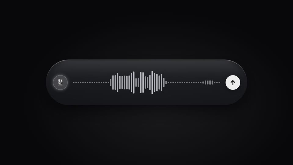
Live voice waveform
A live waveform in a recording pill — 64 thin bars rise and fall with "speech," spiking tall mid-speech and shrinking to a dotted line on pauses, scrolling right to left; a full speak-pause-speak-submit performance.
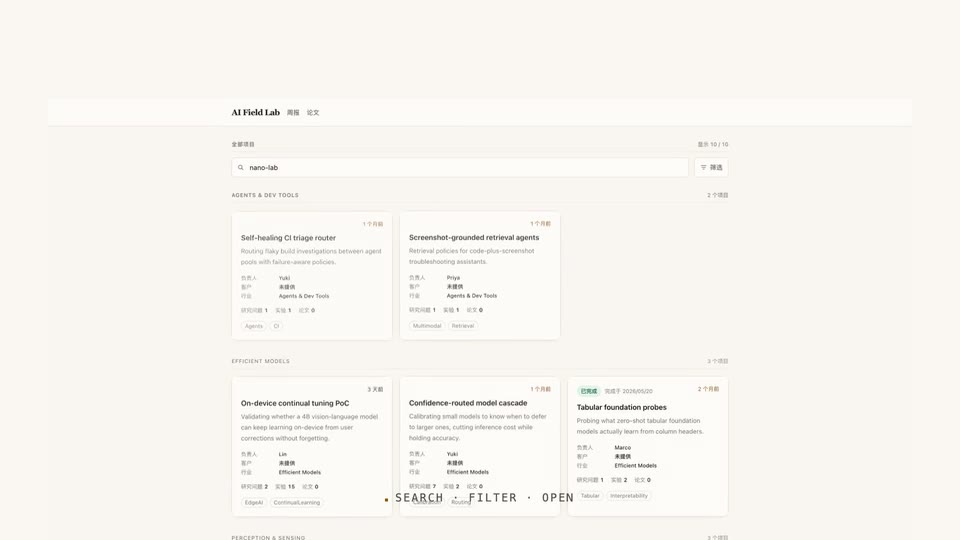
Type, filter, drill in
Typing a search on a real UI, the grid converges to a single card on its own, then a click drills through into the detail page.
Theme switch: sweep and ripple
Two theme-switch moves — theme-sweep, a diagonal wipe (the skin changes wherever the boundary passes), and palette-ripple, a combo move (a ⌘K panel collapses to a point, a ripple spreads from it to re-skin).
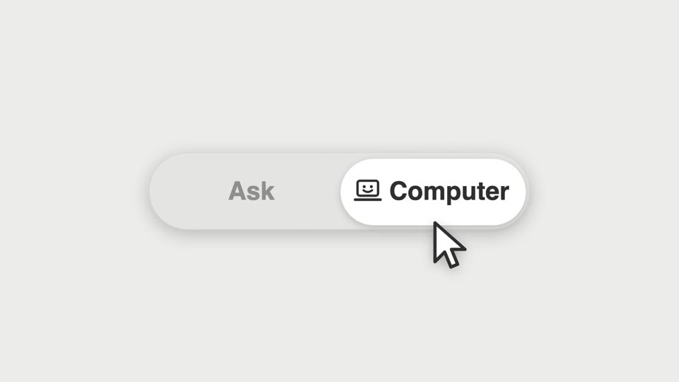
Segmented thumb hero
A segmented control's thumb shift becomes the star of a close-up — a cursor clicks it and a new icon springs in.