Motion · Interaction
Theme switch: sweep and ripple
Two theme-switch moves — theme-sweep, a diagonal wipe (the skin changes wherever the boundary passes), and palette-ripple, a combo move (a ⌘K panel collapses to a point, a ripple spreads from it to re-skin).
Source: video-shotcraft (Vincent Wei) ↗ · Apache-2.0 · Remotion composition (React/TSX) — preview video, no in-browser player
Variants
A dark-version clip-path polygon sweeps a 15° diagonal edge across the screen (out poly3, fast-then-slow, ~38f), with a 4px white bright line and an 18px glow at the boundary; the sweep fades out over 2f after finishing, and the dark version settles with a 1→0.995→1 scale pulse
Directly showcasing a theme feature
The panel springs down with back(1.9), text types in character by character, Enter triggers the panel to ease-in shrink to 0 with a white highlight core pinning its position, then a circular clip radius expands 12→1250px with cubic-out, its edge carrying a 5px white ring glowing in both directions
A highlight passage combining the command palette with the theme change
When to use
Dark-mode/theme feature narrative passages; the same UI "changes color before your eyes" rather than cutting to a new scene
Intention
Two ways to shoot light/dark mode switching. A (Notion/Figma/Linear-style): a 15° diagonal boundary band with a bright line sweeps from top-left to bottom-right; where the boundary passes, light mode changes in place to dark mode, both themes coexisting in the same layout for an instant — the viewer sees "the same UI changing its skin," not a transition. B (a combo variant): a ⌘K panel is typed "dark" and entered, the panel collapses to a bright point, and a dark ripple spreads out from that point across the whole UI — a fully readable cause-and-effect chain of "a command triggers the re-skin." The linchpin for the combo: the ripple's center must be the panel's collapse point, and the start frame must be the frame the collapse completes.
Duration & energy
- Duration: A: 3–4s / B: 5–6s
- Energy: A medium / B medium-high (the combo move has a complete cause-and-effect chain)
Shot recipe (original Chinese — timing, easing, parameter table, known pitfalls)
意图
深浅模式切换的两种拍法。A(Notion/Figma/Linear 惯用):15° 斜向 边界带亮线从左上扫到右下,边界经过处浅色就地变深色,同布局 双主题共存一瞬——观众看到的是"同一个 UI 换肤",不是转场。 B(组合变异):⌘K 面板输入 "dark" 回车,面板收缩成一个亮点, 深色涟漪从该点荡开扫过全 UI——"命令引发换肤"的因果链完整可读。 组合命门:涟漪圆心必须是面板收缩点、起始帧必须是收缩完成帧。
两式选型
| 式 | 做法 | 适用 | |----|------|------| | A theme-sweep-toggle | 深色版 clip-path polygon 15° 斜边扫场(out poly3 先快后缓 ~38f),边界 4px 白亮线+18px 辉光,扫完 2f 淡出;深版 scale 1→0.995→1 坐实 | 主题功能直接展示 | | B palette-theme-ripple | 面板 back(1.9) 弹落→逐字输入→回车面板 ease-in 收缩到 0 + 白色高光核钉住位置→圆形 clip 半径 12→1250px cubic-out 荡开,边缘 5px 白环双向辉光 | 命令面板+主题联动的高光段 |
参数表
| 参数 | 典型值 | 调节手感 | |------|--------|----------| | 深色版制作 | 对色板逐键手工映射(bg/card/border 各自定深色值) | 滤镜反转出来的深色是错的(图像/头像全反) | | A 斜边超扫 | 底端超出 SLANT+40px | 不超扫右下角残留浅色三角 | | A 坐实 | scale 0.995 幅度偏微妙(demo 自评) | 实战可加大到 0.985 | | B 因果钉扎 | 高光核在收缩点挂 10f,涟漪圆心=该点坐标 | 圆心错位/错帧就断了"命令→换肤"因果(组合命门) | | B 浅色层 | 扫场完成后条件卸载 | 真静止前提 |
已知坑
- demo 在灰阶/占位素材上调校通过——参数是调校起点非实战定稿,
首次实战须以真实素材回验
- 两版布局必须逐像素一致——布局有出入就读作"切换到另一个页面",
手法即失效
- 真实页面实战:深浅两版分别真实截图(Q1),不做滤镜假深色
- 一支片主题切换 ≤1 次:它是功能叙事不是转场,反复切读作演示事故
- 声音:A 扫场一声长 whoosh;B 回车一声确认 + 涟漪荡开接 whoosh
(S4 拟音优先)
参考实现
demos/interaction/theme-switch-moves/ (PaletteThemeRipple.tsx / ThemeSweepToggle.tsx)
Reference implementation (Remotion)
- demos/interaction/theme-switch-moves/PaletteThemeRipple.tsx — https://raw.githubusercontent.com/Vincentwei1021/video-shotcraft/main/demos/interaction/theme-switch-moves/PaletteThemeRipple.tsx
- demos/interaction/theme-switch-moves/ThemeSweepToggle.tsx — https://raw.githubusercontent.com/Vincentwei1021/video-shotcraft/main/demos/interaction/theme-switch-moves/ThemeSweepToggle.tsx
The component imports shared fixtures from demos/_fixtures and helpers from assets/lib in the repo; SKILL.md there documents the render workflow.
Everything on this page is also machine-readable. Point your agent at the JSON, or add the gimgs MCP server and ask it to search motion templates.
- Fetch the JSON — it holds the shot recipe (timing, easing, parameter table, pitfalls) and the full TSX source.
- Clone the video-shotcraft repo; the component imports shared fixtures from demos/_fixtures and helpers from assets/lib.
- Register the component as a <Composition> in a Remotion project and render with `npx remotion render`, or re-implement the recipe in your own engine.
curl -s https://gimgs.net/motion/theme-switch-moves.jsongit clone https://github.com/Vincentwei1021/video-shotcraft
# component: demos/interaction/theme-switch-moves/PaletteThemeRipple.tsx, demos/interaction/theme-switch-moves/ThemeSweepToggle.tsx
npx remotion render <CompositionId> out.mp4claude mcp add --transport http gimgs https://gimgs.net/mcp
# then: search_motion_templates / get_motion_template("theme-switch-moves")Prompt
Use the video-shotcraft shot recipe "Theme switch: sweep and ripple" (Remotion composition, Apache-2.0) published on gimgs.net.
Recipe JSON (prompt = timing/easing/parameter table/pitfalls, files = TSX source): https://gimgs.net/motion/theme-switch-moves.json
Raw TSX: https://gimgs.net/motion/theme-switch-moves/template.html
Repository: https://github.com/Vincentwei1021/video-shotcraft  (component: demos/interaction/theme-switch-moves/PaletteThemeRipple.tsx, demos/interaction/theme-switch-moves/ThemeSweepToggle.tsx; imports demos/_fixtures and assets/lib)
Spec: 1920x1080, 30 fps, 4.72s

1. Read the JSON and follow its "prompt" section (when to use, intention, parameter table, known pitfalls).
2. Adapt it for: <describe what you want>.
3. Either clone the repo, register the component as a <Composition> in a Remotion project and run npx remotion render <CompositionId> out.mp4 — or re-implement the recipe in your own engine (HTML/WAAPI works: keep the same timing and easing).
// ===== demos/interaction/theme-switch-moves/PaletteThemeRipple.tsx =====
// 组合:命令面板 × 深浅扫场(palette-theme-ripple)
// FakeDashboard 静置 → 整屏压暗+blur → ⌘K 面板弹落 → 模拟输入"dark"
// (灰块字符逐个弹出)→ 回车帧面板 5f 收缩成一个亮点 → 深色扫场边界
// **从该亮点位置**荡开(clip-path 圆扩张 + 亮边缘环)扫过全 UI 变深色版 → 真静止。
// 组合命门:扫场起点必须是面板收缩点(960,470),收缩完成帧=扫场起始帧
// (RIPPLE=73),从别处/别帧开始就断了因果。
// 关键帧:0–15 浅色静置 → 15–22 压暗 blur → 22–30 面板弹落(超调)→
// 38–62 逐字输入 d/a/r/k → 68 回车 → 68–73 面板收缩成亮点 → 73–95 扫场
// 荡开 → 95–170 深色真静止 75f。深色版为手工反转 G 色板的本地 DarkDashboard。
// 帧确定,无随机源。
import React from 'react';
import { useCurrentFrame, interpolate, Easing } from 'remotion';
import { G, FakeDashboard } from '../../_fixtures/Fixtures';

const DIM_START = 15;
const PANEL_IN = 22;
const TYPE_FRAMES = [38, 46, 54, 62]; // d a r k
const ENTER = 68;
const RIPPLE = 73; // 面板收缩完成帧 = 扫场起始帧(组合命门)
const RIPPLE_END = 95;
const ORIGIN = { x: 960, y: 470 }; // 面板中心 = 收缩点 = 扫场圆心
const MAX_R = 1250;

// 手工反转 G 色板的深色版
const D = {
  bg: '#1a1a1c', panel: '#232325', line: '#3a3a38', bar: '#6f6f6d',
  ink: '#e8e8e6', mid: '#7a7a78', card: '#262628', border: '#454543',
  side: '#0e0e10', sideBar: '#555553',
};

const DarkCard: React.FC<{ seed: number }> = ({ seed }) => {
  const titleW = 45 + ((seed * 37) % 40);
  const lines = 2 + (seed % 3);
  return (
    <div style={{ width: '100%', height: '100%', background: D.card, border: `2px solid ${D.border}`, borderRadius: 14, padding: 18, boxSizing: 'border-box', display: 'flex', flexDirection: 'column', gap: 10 }}>
      <div style={{ height: 16, width: `${titleW}%`, background: D.bar, borderRadius: 8 }} />
      {Array.from({ length: lines }).map((_, i) => (
        <div key={i} style={{ height: 10, width: `${88 - i * 14 - (seed % 5) * 3}%`, background: D.line, borderRadius: 5 }} />
      ))}
      <div style={{ marginTop: 'auto', display: 'flex', gap: 8, alignItems: 'center' }}>
        <div style={{ width: 26, height: 26, borderRadius: 13, background: D.mid }} />
        <div style={{ height: 10, width: 64, background: D.line, borderRadius: 5 }} />
      </div>
    </div>
  );
};

// 与 FakeDashboard variant A 布局逐像素一致的深色版——扫场读作"同一 UI 换肤"
const DarkDashboard: React.FC = () => (
  <div style={{ width: 1920, height: 1080, background: D.bg, display: 'flex' }}>
    <div style={{ width: 220, background: D.side, padding: '28px 22px', boxSizing: 'border-box', display: 'flex', flexDirection: 'column', gap: 18 }}>
      <div style={{ width: 40, height: 40, borderRadius: 10, background: '#8a8a88' }} />
      {Array.from({ length: 7 }).map((_, i) => (
        <div key={i} style={{ height: 12, width: `${60 + ((i * 29) % 35)}%`, background: D.sideBar, borderRadius: 6 }} />
      ))}
    </div>
    <div style={{ flex: 1, display: 'flex', flexDirection: 'column' }}>
      <div style={{ height: 72, background: D.panel, borderBottom: `2px solid ${D.line}`, display: 'flex', alignItems: 'center', padding: '0 32px', gap: 20, boxSizing: 'border-box' }}>
        <div style={{ height: 18, width: 180, background: D.bar, borderRadius: 9 }} />
        <div style={{ marginLeft: 'auto', height: 36, width: 320, background: D.card, border: `2px solid ${D.line}`, borderRadius: 18, boxSizing: 'border-box' }} />
        <div style={{ width: 36, height: 36, borderRadius: 18, background: D.mid }} />
      </div>
      <div style={{ flex: 1, padding: 36, display: 'grid', gridTemplateColumns: 'repeat(3, 1fr)', gridAutoRows: '1fr', gap: 28, boxSizing: 'border-box' }}>
        {Array.from({ length: 6 }).map((_, i) => (
          <DarkCard key={i} seed={i + 1} />
        ))}
      </div>
    </div>
  </div>
);

export const PaletteThemeRipple: React.FC = () => {
  const f = useCurrentFrame();

  // 压暗 + blur:面板阶段生效,扫场完成后浅色层已被卸载
  const dim = interpolate(f, [DIM_START, DIM_START + 7], [0, 1], {
    extrapolateLeft: 'clamp', extrapolateRight: 'clamp',
  });

  // 面板弹落(back-out 超调)
  const panelT = interpolate(f, [PANEL_IN, PANEL_IN + 8], [0, 1], {
    extrapolateLeft: 'clamp', extrapolateRight: 'clamp',
    easing: Easing.out(Easing.back(1.9)),
  });
  // 回车后 5f 收缩成一点(ease-in,越缩越快)
  const shrink = interpolate(f, [ENTER, RIPPLE], [1, 0], {
    extrapolateLeft: 'clamp', extrapolateRight: 'clamp',
    easing: Easing.in(Easing.cubic),
  });
  const panelMounted = f >= PANEL_IN && f < RIPPLE;
  const panelScale = f < ENTER ? panelT : shrink;
  const panelDropY = f < ENTER ? interpolate(panelT, [0, 1], [-120, 0]) : 0;

  // 逐字输入:每个灰块 4f 内弹出
  const charScale = (i: number) =>
    interpolate(f, [TYPE_FRAMES[i], TYPE_FRAMES[i] + 4], [0, 1], {
      extrapolateLeft: 'clamp', extrapolateRight: 'clamp',
      easing: Easing.out(Easing.back(2.2)),
    });
  const typedCount = TYPE_FRAMES.filter((t) => f >= t).length;

  // 扫场:圆从收缩点荡开(ease-out,先快后缓),边缘带亮环
  const r = interpolate(f, [RIPPLE, RIPPLE_END], [12, MAX_R], {
    extrapolateLeft: 'clamp', extrapolateRight: 'clamp',
    easing: Easing.out(Easing.cubic),
  });
  const rippling = f >= RIPPLE && f < RIPPLE_END;
  const done = f >= RIPPLE_END;
  const ringOpacity = interpolate(f, [RIPPLE, RIPPLE_END], [0.95, 0], {
    extrapolateLeft: 'clamp', extrapolateRight: 'clamp',
  });

  // 亮点:收缩完成前后 3f 的高光核(把"收缩点=扫场起点"钉死给观众看)
  const dotOn = f >= ENTER + 2 && f < RIPPLE + 3;

  return (
    <div style={{ width: 1920, height: 1080, background: D.bg, position: 'relative', overflow: 'hidden' }}>
      {/* 浅色层:扫场完成后条件卸载(真静止) */}
      {!done && (
        <div style={{ position: 'absolute', inset: 0, filter: dim > 0 ? `brightness(${1 - dim * 0.45}) blur(${dim * 6}px)` : 'none' }}>
          <FakeDashboard variant="A" />
        </div>
      )}

      {/* 深色层:从收缩点起被圆形 clip 揭开;完成后铺满且无 clip */}
      {(rippling || done) && (
        <div style={{ position: 'absolute', inset: 0, clipPath: done ? 'none' : `circle(${r}px at ${ORIGIN.x}px ${ORIGIN.y}px)` }}>
          <DarkDashboard />
        </div>
      )}

      {/* 扫场亮边缘环 */}
      {rippling && (
        <div
          style={{
            position: 'absolute',
            left: ORIGIN.x - r,
            top: ORIGIN.y - r,
            width: r * 2,
            height: r * 2,
            borderRadius: '50%',
            border: '5px solid rgba(255,255,255,0.9)',
            opacity: ringOpacity,
            boxShadow: '0 0 40px rgba(255,255,255,0.5), inset 0 0 30px rgba(255,255,255,0.35)',
          }}
        />
      )}

      {/* 收缩亮点 */}
      {dotOn && (
        <div
          style={{
            position: 'absolute',
            left: ORIGIN.x - 11,
            top: ORIGIN.y - 11,
            width: 22,
            height: 22,
            borderRadius: 11,
            background: '#ffffff',
            boxShadow: '0 0 46px 14px rgba(255,255,255,0.85)',
          }}
        />
      )}

      {/* ⌘K 命令面板 */}
      {panelMounted && (
        <div
          style={{
            position: 'absolute',
            left: ORIGIN.x - 340,
            top: ORIGIN.y - 130 + panelDropY,
            width: 680,
            height: 260,
            transform: `scale(${Math.max(panelScale, 0.001)})`,
            transformOrigin: 'center center',
            background: G.card,
            border: `2px solid ${G.border}`,
            borderRadius: 18,
            boxShadow: '0 30px 80px rgba(0,0,0,0.4)',
            padding: 24,
            boxSizing: 'border-box',
            display: 'flex',
            flexDirection: 'column',
            gap: 16,
          }}
        >
          {/* 输入行:⌘K 标识 + 逐字灰块 */}
          <div style={{ height: 62, border: `2px solid ${G.line}`, borderRadius: 12, display: 'flex', alignItems: 'center', gap: 14, padding: '0 18px', boxSizing: 'border-box' }}>
            <div style={{ padding: '6px 12px', borderRadius: 8, background: G.side, color: '#fff', fontFamily: 'Helvetica, Arial, sans-serif', fontWeight: 800, fontSize: 22 }}>⌘K</div>
            {TYPE_FRAMES.map((_, i) => (
              <div key={i} style={{ width: 30, height: 30, borderRadius: 6, background: G.ink, transform: `scale(${charScale(i)})` }} />
            ))}
            {/* 光标:帧确定闪烁(每 8f 翻转) */}
            <div style={{ width: 4, height: 34, background: G.ink, opacity: Math.floor(f / 8) % 2 === 0 ? 1 : 0 }} />
          </div>
          {/* 结果行:输入完成后首行加深表示选中 */}
          {Array.from({ length: 3 }).map((_, i) => (
            <div key={i} style={{ height: 44, borderRadius: 10, background: i === 0 && typedCount === 4 ? G.line : G.panel, display: 'flex', alignItems: 'center', gap: 14, padding: '0 16px', boxSizing: 'border-box' }}>
              <div style={{ width: 24, height: 24, borderRadius: 6, background: G.mid }} />
              <div style={{ height: 12, width: `${34 + i * 16}%`, background: G.bar, borderRadius: 6 }} />
            </div>
          ))}
        </div>
      )}
    </div>
  );
};


// ===== demos/interaction/theme-switch-moves/ThemeSweepToggle.tsx =====
// theme-sweep-toggle —— 深浅模式扫场
// 同一 dashboard 深浅两版叠放(深版手工映射 G 色板),上层深版用 clip-path
// polygon 15° 斜边从左上扫到右下(先快后缓),边界带 2px 亮线;
// 扫完深版整体 scale 0.995→1 "坐实"。f=70 后全静止(70f)。
import React from 'react';
import { useCurrentFrame, interpolate, Easing } from 'remotion';

const CL = { extrapolateLeft: 'clamp', extrapolateRight: 'clamp' } as const;

// 浅色板 = Fixtures G;深色板手工反转映射
type Pal = {
  bg: string; panel: string; line: string; bar: string;
  mid: string; card: string; border: string; side: string; sideBar: string;
};
const LIGHT: Pal = {
  bg: '#ececea', panel: '#f7f7f6', line: '#dcdcda', bar: '#c2c2c0',
  mid: '#8f8f8d', card: '#ffffff', border: '#d8d8d6', side: '#3a3a3a', sideBar: '#5a5a58',
};
const DARK: Pal = {
  bg: '#1c1c1b', panel: '#242423', line: '#3a3a38', bar: '#6e6e6c',
  mid: '#8f8f8d', card: '#2c2c2b', border: '#454543', side: '#0f0f0e', sideBar: '#6a6a68',
};

// 带色板参数的 dashboard(结构同 Fixtures.FakeDashboard variant A)
const Dash: React.FC<{ p: Pal }> = ({ p }) => (
  <div style={{ width: 1920, height: 1080, background: p.bg, display: 'flex' }}>
    <div style={{ width: 220, background: p.side, padding: '28px 22px', boxSizing: 'border-box', display: 'flex', flexDirection: 'column', gap: 18 }}>
      <div style={{ width: 40, height: 40, borderRadius: 10, background: p.sideBar }} />
      {Array.from({ length: 7 }).map((_, i) => (
        <div key={i} style={{ height: 12, width: `${60 + ((i * 29) % 35)}%`, background: p.sideBar, borderRadius: 6 }} />
      ))}
    </div>
    <div style={{ flex: 1, display: 'flex', flexDirection: 'column' }}>
      <div style={{ height: 72, background: p.panel, borderBottom: `2px solid ${p.line}`, display: 'flex', alignItems: 'center', padding: '0 32px', gap: 20, boxSizing: 'border-box' }}>
        <div style={{ height: 18, width: 180, background: p.bar, borderRadius: 9 }} />
        <div style={{ marginLeft: 'auto', height: 36, width: 320, background: p.card, border: `2px solid ${p.line}`, borderRadius: 18, boxSizing: 'border-box' }} />
        <div style={{ width: 36, height: 36, borderRadius: 18, background: p.mid }} />
      </div>
      <div style={{ flex: 1, padding: 36, display: 'grid', gridTemplateColumns: 'repeat(3, 1fr)', gridAutoRows: '1fr', gap: 28, boxSizing: 'border-box' }}>
        {Array.from({ length: 6 }).map((_, i) => {
          const titleW = 45 + (((i + 1) * 37) % 40);
          const lines = 2 + ((i + 1) % 3);
          return (
            <div key={i} style={{ background: p.card, border: `2px solid ${p.border}`, borderRadius: 14, padding: 18, boxSizing: 'border-box', display: 'flex', flexDirection: 'column', gap: 10 }}>
              <div style={{ height: 16, width: `${titleW}%`, background: p.bar, borderRadius: 8 }} />
              {Array.from({ length: lines }).map((_, j) => (
                <div key={j} style={{ height: 10, width: `${88 - j * 14 - ((i + 1) % 5) * 3}%`, background: p.line, borderRadius: 5 }} />
              ))}
              <div style={{ marginTop: 'auto', display: 'flex', gap: 8, alignItems: 'center' }}>
                <div style={{ width: 26, height: 26, borderRadius: 13, background: p.mid }} />
                <div style={{ height: 10, width: 64, background: p.line, borderRadius: 5 }} />
              </div>
            </div>
          );
        })}
      </div>
    </div>
  </div>
);

// 时间轴
const SWEEP0 = 14; // 扫场开始(前 14f 初始静置)
const SWEEP1 = 52; // 扫场结束
const SETTLE0 = 52;
const SETTLE1 = 64; // 坐实结束 → 之后全静止

const SLANT = 1080 * Math.tan((15 * Math.PI) / 180); // ≈ 289px,15° 斜边

export const ThemeSweepToggle: React.FC = () => {
  const frame = useCurrentFrame();

  // 边界顶端 x:先快后缓(poly(3) out);从左外扫到右外+SLANT 保证底边也扫尽
  const p = interpolate(frame, [SWEEP0, SWEEP1], [-20, 1920 + SLANT + 40], {
    easing: Easing.out(Easing.poly(3)),
    ...CL,
  });

  // 坐实:0.995 → 1
  const settle = interpolate(frame, [SETTLE0, SETTLE0 + 1, SETTLE1], [1, 0.995, 1], {
    easing: Easing.out(Easing.cubic),
    ...CL,
  });

  // 亮线透明度:扫场期间可见,扫完 6f 内淡出
  const lineOp = interpolate(frame, [SWEEP0, SWEEP0 + 4, SWEEP1 - 4, SWEEP1 + 2], [0, 1, 1, 0], CL);
  const sweeping = frame >= SWEEP0 && frame < SWEEP1 + 2;

  return (
    <div style={{ width: 1920, height: 1080, position: 'relative', overflow: 'hidden', background: LIGHT.bg }}>
      {/* 底层浅色版 */}
      <Dash p={LIGHT} />
      {/* 上层深色版,clip-path 斜切揭出 */}
      <div
        style={{
          position: 'absolute',
          inset: 0,
          clipPath: `polygon(0 0, ${p}px 0, ${p - SLANT}px 1080px, 0 1080px)`,
          transform: `scale(${settle})`,
          transformOrigin: '50% 50%',
        }}
      >
        <Dash p={DARK} />
      </div>
      {/* 2px 亮线边界(条件卸载) */}
      {sweeping && (
        <div
          style={{
            position: 'absolute',
            left: p - SLANT / 2 - 2,
            top: 540 - 620,
            width: 4,
            height: 1240,
            background: '#ffffff',
            boxShadow: '0 0 18px 4px rgba(255,255,255,0.75)',
            transform: 'rotate(15deg)',
            transformOrigin: '50% 50%',
            opacity: lineOp,
          }}
        />
      )}
    </div>
  );
};
- Read the recipePrompt = when to use, intention, parameter table with typical values and how each one feels, known pitfalls. Treat values as calibrated starting points.
- Get the codetool: git
git clone https://github.com/Vincentwei1021/video-shotcraft && cd video-shotcraft && npm install - Register + rendertool: remotion
npx remotion render <CompositionId> out.mp4 # component: demos/interaction/theme-switch-moves/PaletteThemeRipple.tsx, demos/interaction/theme-switch-moves/ThemeSweepToggle.tsx - Or re-implementPort the timing/easing from the recipe to HTML + WAAPI (gimgs motion contract) or any engine; keep the same segment windows and easing.
| param | type | default | description |
|---|---|---|---|
| — | |||
More in this category
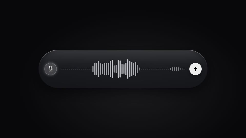
Live voice waveform
A live waveform in a recording pill — 64 thin bars rise and fall with "speech," spiking tall mid-speech and shrinking to a dotted line on pauses, scrolling right to left; a full speak-pause-speak-submit performance.
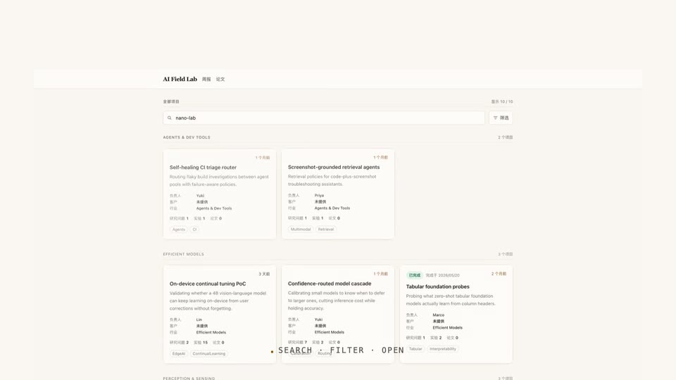
Type, filter, drill in
Typing a search on a real UI, the grid converges to a single card on its own, then a click drills through into the detail page.
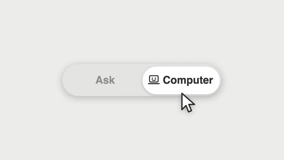
Segmented thumb hero
A segmented control's thumb shift becomes the star of a close-up — a cursor clicks it and a new icon springs in.
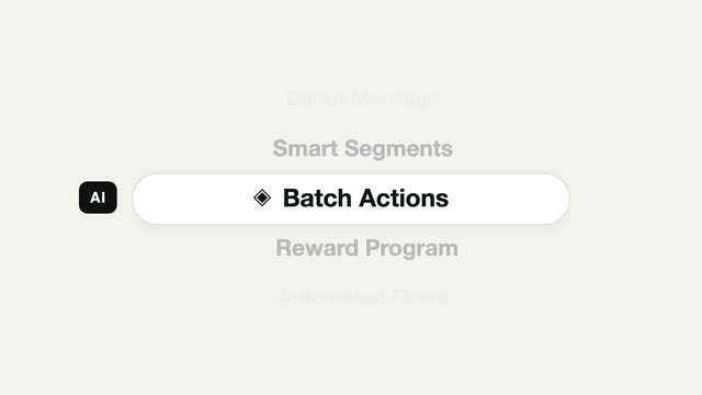
Picker carousel feature cycle
A mobile-style vertical picker — the focus pill stays still while content scrolls through it, snapping to a full stop each time.