Motion · Interaction
Picker carousel feature cycle
A mobile-style vertical picker — the focus pill stays still while content scrolls through it, snapping to a full stop each time.
Source: video-shotcraft (Vincent Wei) ↗ · Apache-2.0 · Remotion composition (React/TSX) — preview video, no in-browser player
When to use
A shot that reads off feature/scene names one by one; a "pick one" interaction demo; a picker-control showcase for mobile products
Intention
Give the physical feel of "selecting" something: the focus frame is fixed, it's the content that scrolls and gets snapped into it. Each item must actually go still for a few frames after stopping — continuous scrolling reads as a loading animation, only a pause reads as "this item is now selected." Distance-based decay (opacity + font size + grayscale all fading together with distance from center) is the only way to keep the viewer's eye locked on the middle row.
Duration & energy
- Duration: About 3.6s (108f@30fps)
- Energy: Medium (every snap is a beat, five beats advancing at a steady pace)
Shot recipe (original Chinese — timing, easing, parameter table, known pitfalls)
意图
把"选择"这件事的物理感做出来:焦点框是固定的,是内容在滚动并被吸住。 每项停下后必须真的静止几帧——连续滚动读作 loading 动画,停顿才读作 "这一项被选中了"。距离衰减(透明度 + 字号 + 灰度三通道同时衰减)是让 观众视线始终锁在中间那一行的唯一手段。
动效核心
- 视口 300×170px(5 行 × rowH 34),焦点药丸固定在第 3 行位置
(top: rowH*2),白底 + 1px #E3E3E6 描边 + 0 2px 8px rgba(0,0,0,.06)
- 全程
t 0.05→0.95匀速切成 STEPS=5 步;步内位移
outQuint(min(1, local/(1−HOLD))),HOLD=5/14 的尾段完全不动 (每步≈0.65s = 走位≈0.42s + 静止≈0.23s)
- 列表整体
translateY(rowH*2 − pos*rowH)——移动的是内容,药丸零位移 - 距离衰减(
d = |i − pos|)分三段:opacityd≤1时 1→0.55、
1<d≤2 时 0.55→0.18;fontSize 17→14px(按 d/2); color d<0.5 用 INK、d<1.5 用 MID、更远用 #B9B9BE
- 行内图标 opacity
max(0, 1 − d*1.6)——只有焦点行看得见图标 - 落定后药丸
scaleY 1 + sin(min(1, land/0.6)·π)*0.06呼吸一下
(land 只在 HOLD 段内 >0,即吸附完成才呼吸)
- 视口上下各 26% 的 PAPER→透明渐变遮罩,让进出项自然消隐
参数表
| 参数 | 典型值 | 调节手感 | |------|--------|----------| | 行高/可见行数 | rowH 34px × 5 行,焦点在第 3 行 | 可见行数必须是奇数,否则焦点行不在视觉正中 | | 步数 | STEPS=5,窗口 t 0.05→0.95 匀速 | 5 拍是 3.6s 的舒适上限;7 拍每拍就压到 0.46s 读不清 | | HOLD | 5/14 ≈ 0.357(每步尾段静止≈0.23s) | 命门:HOLD 归零就变成匀速滚动,完全丢掉"吸附"语义 | | 吸附缓动 | outQuint(作用在 local/(1−HOLD) 上) | outQuint 的急减速就是"被磁铁吸住"的手感,outCubic 太软 | | opacity 衰减 | 1 → 0.55(d≤1)→ 0.18(d≤2) | 相邻行留 0.55 是让观众感知"上下还有内容";降到 0.3 就孤立了 | | fontSize 衰减 | 17→14px,按 min(1, d/2) | 字号差是第二重景深;只做透明度会显得扁 | | 图标可见性 | max(0, 1 − d·1.6) | 只有焦点行带图标,是"当前项"的额外标记 | | 药丸呼吸 | scaleY 1→1.06→1,落定后 0.6·HOLD 内走完 | 0.06 已到上限;再大就读作药丸自己在动,抢了内容的戏 |
已知坑
- 药丸必须是
translateY零位移的固定层,scaleY呼吸也不能带
位移,否则焦点框漂移,"内容穿过焦点"的语义立刻失效
- 距离衰减写在
fontSize上会触发逐帧重排(行高固定所以布局不跳),
行高若改成 auto 就会抖;rowH 必须写死
- 渐变遮罩的颜色要与背景 PAPER 完全一致,差一档就露出边界带
- 左外侧 26×22 的方形 AI 徽标用
margin:-11px 0 0 -186px相对画面中心
定位;改视口宽度必须同改 186px
- ITEMS 是 7 条占位功能名("Data Cleanup" 等),落地换真实功能名时
字长变化会影响居中观感——单行超过 300px 就要缩字号而不是换行
参考实现
demos/interaction/picker-carousel-feature-cycle/ (PickerCarouselFeatureCycle.tsx)
Reference implementation (Remotion)
- demos/interaction/picker-carousel-feature-cycle/PickerCarouselFeatureCycle.tsx — https://raw.githubusercontent.com/Vincentwei1021/video-shotcraft/main/demos/interaction/picker-carousel-feature-cycle/PickerCarouselFeatureCycle.tsx
The component imports shared fixtures from demos/_fixtures and helpers from assets/lib in the repo; SKILL.md there documents the render workflow.
Everything on this page is also machine-readable. Point your agent at the JSON, or add the gimgs MCP server and ask it to search motion templates.
- Fetch the JSON — it holds the shot recipe (timing, easing, parameter table, pitfalls) and the full TSX source.
- Clone the video-shotcraft repo; the component imports shared fixtures from demos/_fixtures and helpers from assets/lib.
- Register the component as a <Composition> in a Remotion project and render with `npx remotion render`, or re-implement the recipe in your own engine.
curl -s https://gimgs.net/motion/picker-carousel-feature-cycle.jsongit clone https://github.com/Vincentwei1021/video-shotcraft
# component: demos/interaction/picker-carousel-feature-cycle/PickerCarouselFeatureCycle.tsx
npx remotion render <CompositionId> out.mp4claude mcp add --transport http gimgs https://gimgs.net/mcp
# then: search_motion_templates / get_motion_template("picker-carousel-feature-cycle")Prompt
Use the video-shotcraft shot recipe "Picker carousel feature cycle" (Remotion composition, Apache-2.0) published on gimgs.net.
Recipe JSON (prompt = timing/easing/parameter table/pitfalls, files = TSX source): https://gimgs.net/motion/picker-carousel-feature-cycle.json
Raw TSX: https://gimgs.net/motion/picker-carousel-feature-cycle/template.html
Repository: https://github.com/Vincentwei1021/video-shotcraft  (component: demos/interaction/picker-carousel-feature-cycle/PickerCarouselFeatureCycle.tsx; imports demos/_fixtures and assets/lib)
Spec: 1920x1080, 30 fps, 4.1s

1. Read the JSON and follow its "prompt" section (when to use, intention, parameter table, known pitfalls).
2. Adapt it for: <describe what you want>.
3. Either clone the repo, register the component as a <Composition> in a Remotion project and run npx remotion render <CompositionId> out.mp4 — or re-implement the recipe in your own engine (HTML/WAAPI works: keep the same timing and easing).
// ===== demos/interaction/picker-carousel-feature-cycle/PickerCarouselFeatureCycle.tsx =====
// picker-carousel-feature-cycle — Picker Carousel 功能名吸附轮播(motion-lab 定稿转原生 Remotion)
// 移动端风竖向选择器:焦点药丸不动、内容穿过它,每项停靠 0.45s 且带明显 outQuint
// 减速吸附 + 4–5 帧静止;按到中心距离分层控制 opacity/字号/灰度,落定时药丸做
// scaleY 1→1.06→1 极轻呼吸,左外侧固定方形 AI 徽标。
// 设计坐标 480×270(DesignStage 等比放大),参数表数值以此坐标系标定。
import React from 'react';
import { DesignStage, E, lerp, seg, useT } from '../../_fixtures/Motion';

export const PICKER_CAROUSEL_FEATURE_CYCLE_DURATION = 108; // 3600ms @30fps

const PAPER = '#F3F3F1';
const INK = '#111113';
const MID = '#8A8A8F';
const ROW_H = 34; // 单行高度
const ITEMS = [
  'Data Cleanup',
  'Direct Message',
  'Smart Segments',
  'Batch Actions',
  'Reward Program',
  'Automated Flows',
  'Variant Testing',
];
const ICONS = ['◎', '✉', '◧', '◈', '★', '↺', '⚑'];
const STEPS = 5; // 五次吸附推进
const HOLD = 5 / 14; // 每步末段静止占比(≈4–5 帧不动)

export const PickerCarouselFeatureCycle: React.FC = () => {
  const t = useT();

  // 主时间轴:t∈[0.05,0.95] 均分 5 步;步内前 (1-HOLD) 用 outQuint 吸附,末段静止
  const g = seg(t, 0.05, 0.95) * STEPS;
  const step = Math.min(STEPS - 1, Math.floor(g));
  const local = Math.min(1, g - step);
  const mv = E.outQuint(Math.min(1, local / (1 - HOLD)));
  const pos = step + mv;

  // 落定呼吸:吸附完成进入 HOLD 后,药丸 scaleY 1→1.06→1 极轻脉冲
  const land = Math.max(0, (local - (1 - HOLD)) / HOLD);
  const breath = land > 0 ? Math.sin(Math.min(1, land / 0.6) * Math.PI) * 0.06 : 0;

  return (
    <DesignStage bg={PAPER}>
      {/* 纸面底 —— 与原采集页 paper() 容器一致 */}
      <div
        style={{
          position: 'absolute',
          inset: 0,
          overflow: 'hidden',
          background: PAPER,
          fontFamily: "-apple-system,'Helvetica Neue',Helvetica,Arial,sans-serif",
        }}
      >
        {/* 选择器视口:300×(34×5) 居中,整体在开头 5% 内淡入 */}
        <div
          style={{
            position: 'absolute',
            left: '50%',
            top: '50%',
            width: 300,
            height: ROW_H * 5,
            transform: 'translate(-50%,-50%)',
            overflow: 'hidden',
            opacity: seg(t, 0, 0.05),
          }}
        >
          {/* 焦点药丸:位置不动,仅落定时 scaleY 呼吸。
              原采集页是 content-box,带 1px 边框需显式声明,否则高度差 2px */}
          <div
            style={{
              position: 'absolute',
              left: 0,
              right: 0,
              top: ROW_H * 2,
              height: ROW_H,
              boxSizing: 'content-box',
              borderRadius: 999,
              background: '#fff',
              border: '1px solid #E3E3E6',
              boxShadow: '0 2px 8px rgba(0,0,0,.06)',
              transform: `scaleY(${1 + breath})`,
            }}
          />
          {/* 内容列:整列 translateY 穿过焦点药丸 */}
          <div
            style={{
              position: 'absolute',
              left: 0,
              right: 0,
              top: 0,
              transform: `translateY(${ROW_H * 2 - pos * ROW_H}px)`,
            }}
          >
            {ITEMS.map((txt, i) => {
              // 按到中心距离分层:透明度两段线性、字号 17→14、颜色三档灰度
              const d = Math.abs(i - pos);
              const k2 = Math.min(2, d);
              const o = k2 <= 1 ? lerp(k2, 1, 0.55) : lerp(k2 - 1, 0.55, 0.18);
              return (
                <div
                  key={i}
                  style={{
                    height: ROW_H,
                    display: 'flex',
                    alignItems: 'center',
                    justifyContent: 'center',
                    gap: 8,
                    fontWeight: 600,
                    fontSize: lerp(Math.min(1, d / 2), 17, 14),
                    lineHeight: 1,
                    fontFamily: "-apple-system,'Helvetica Neue',sans-serif",
                    color: d < 0.5 ? INK : d < 1.5 ? MID : '#B9B9BE',
                    opacity: o,
                  }}
                >
                  {/* 图标仅在贴近焦点时浮现(d<0.625 内可见) */}
                  <span style={{ fontSize: 14, opacity: Math.max(0, 1 - d * 1.6) }}>
                    {ICONS[i]}
                  </span>
                  <span>{txt}</span>
                </div>
              );
            })}
          </div>
          {/* 上下渐隐罩:纸色→透明→纸色,盖在列表之上 */}
          <div
            style={{
              position: 'absolute',
              inset: 0,
              pointerEvents: 'none',
              background: `linear-gradient(180deg,${PAPER} 0%,rgba(243,243,241,0) 26%,rgba(243,243,241,0) 74%,${PAPER} 100%)`,
            }}
          />
        </div>
        {/* 左外侧固定 AI 徽标:黑底白字方形圆角,开头略滞后淡入 */}
        <div
          style={{
            position: 'absolute',
            left: '50%',
            top: '50%',
            margin: '-11px 0 0 -186px',
            width: 26,
            height: 22,
            borderRadius: 6,
            background: INK,
            color: '#fff',
            display: 'flex',
            alignItems: 'center',
            justifyContent: 'center',
            fontWeight: 700,
            fontSize: 10,
            lineHeight: 1,
            fontFamily: '-apple-system,sans-serif',
            letterSpacing: 0.5,
            opacity: seg(t, 0.02, 0.09),
          }}
        >
          AI
        </div>
      </div>
    </DesignStage>
  );
};
- Read the recipePrompt = when to use, intention, parameter table with typical values and how each one feels, known pitfalls. Treat values as calibrated starting points.
- Get the codetool: git
git clone https://github.com/Vincentwei1021/video-shotcraft && cd video-shotcraft && npm install - Register + rendertool: remotion
npx remotion render <CompositionId> out.mp4 # component: demos/interaction/picker-carousel-feature-cycle/PickerCarouselFeatureCycle.tsx - Or re-implementPort the timing/easing from the recipe to HTML + WAAPI (gimgs motion contract) or any engine; keep the same segment windows and easing.
| param | type | default | description |
|---|---|---|---|
| — | |||
More in this category
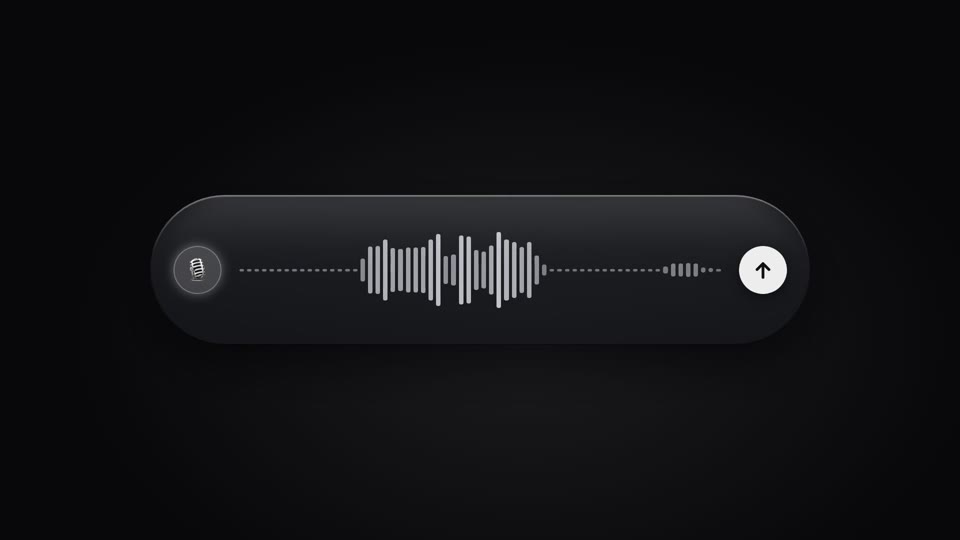
Live voice waveform
A live waveform in a recording pill — 64 thin bars rise and fall with "speech," spiking tall mid-speech and shrinking to a dotted line on pauses, scrolling right to left; a full speak-pause-speak-submit performance.
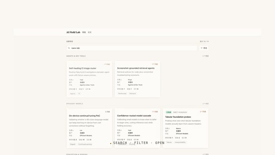
Type, filter, drill in
Typing a search on a real UI, the grid converges to a single card on its own, then a click drills through into the detail page.
Theme switch: sweep and ripple
Two theme-switch moves — theme-sweep, a diagonal wipe (the skin changes wherever the boundary passes), and palette-ripple, a combo move (a ⌘K panel collapses to a point, a ripple spreads from it to re-skin).
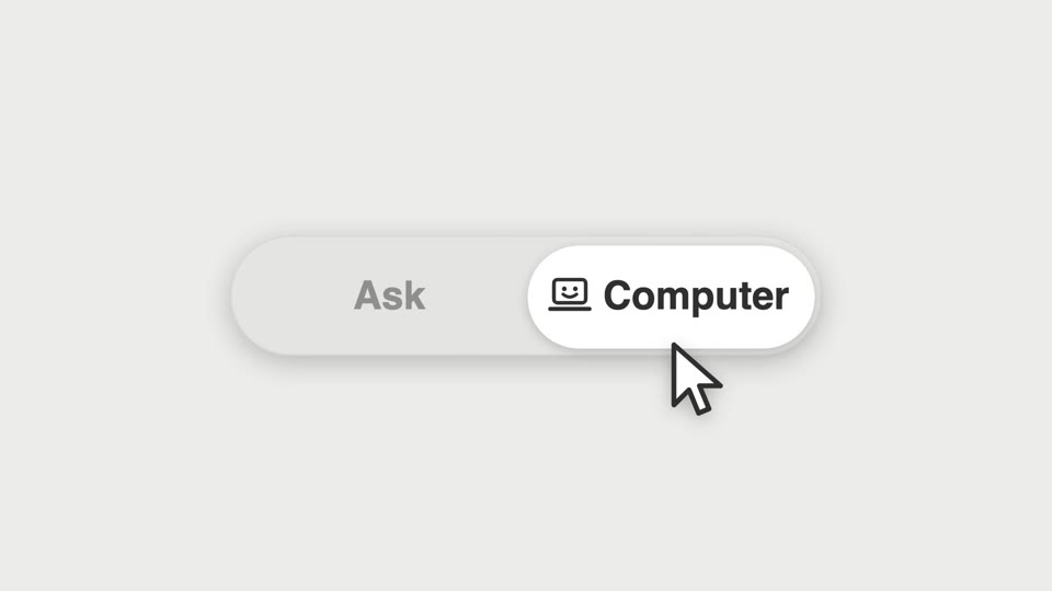
Segmented thumb hero
A segmented control's thumb shift becomes the star of a close-up — a cursor clicks it and a new icon springs in.